[DESIGN CHALLENGE][BRAND IDENTITY]
Bearimy: Branding a Time-Travel Company From Scratch
A design challenge asked for two launch ads for a time-travel company with no name, no audience and no look. Here’s how I filled in the blanks.
- For a Senior Brand Designer design challenge, Ryker was asked to create two social ads launching a time-travel company, and to invent everything else about it.
- He started by brainstorming dozens of names in Lucidspark, ruling out ones that felt too sci-fi, too expected or too much like a pop reference.
- He landed on Bearimy, a nod to “Jeremy Bearimy,” the loopy timeline from The Good Place. It’s a fun reference without being too weird.
- Instead of sci-fi, the brand sells time travel like a heritage luxury trip, built from a moodboard of vintage watch, golf and fashion ads.
- The system is a red serif logo, warm film photography with a watch in every shot, and tall condensed headlines. Ryker made three Instagram ads instead of two.
Summarized by AI from this page. The long version is below.
Here’s the whole prompt from a Senior Brand Designer design challenge I did:
A time-travel company is preparing to launch to the public. The technology works. Now they need people to trust it, want it, and book a trip. Everything else about the company, its name, personality, audience, destinations, and what it looks like, is up to you. Design two social ads announcing the company’s public launch, built on a shared brand and visual system. Beyond that, the approach is yours.
They said they cared more about the thinking than the volume, so this post is mostly the thinking.
Naming it
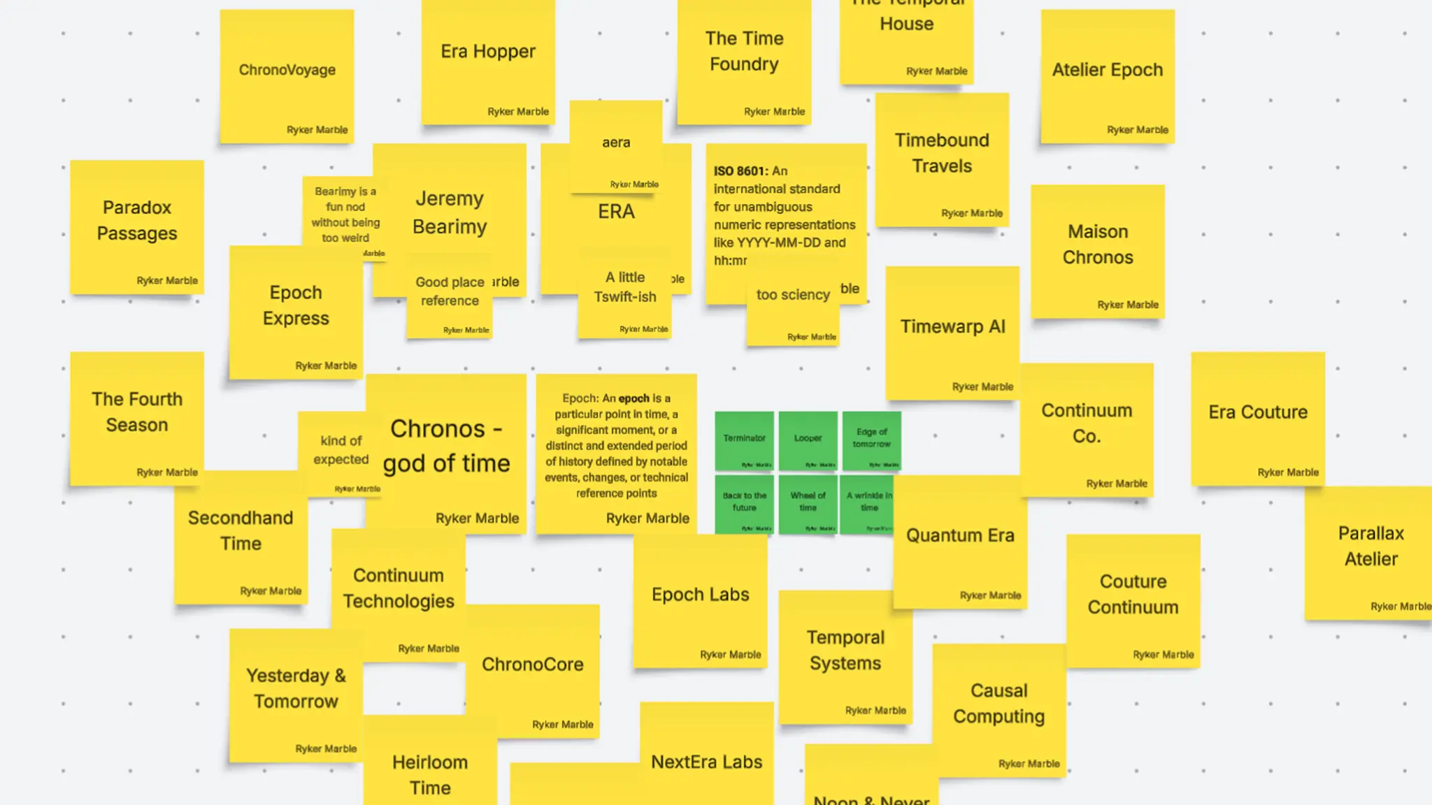
A company with no name has no personality yet, so I started there. I filled a Lucidspark board with names and then left small notes on them as I went.
The names fell into a few camps. Some were sci-fi: ChronoCore, Timewarp AI, Quantum Era, Causal Computing. Those sounded like the technology, but the technology already works. People don’t need to be sold on the machine. They need to trust it and want to go. Some were fashion-house names, like Maison Chronos, Atelier Epoch and Era Couture, and those were closer to the feeling I wanted. Chronos, the god of time, was kind of expected. ERA was a little Taylor Swift. And something like ISO 8601, the standard for writing dates, was too sciency to sell a vacation.
Jeremy Bearimy
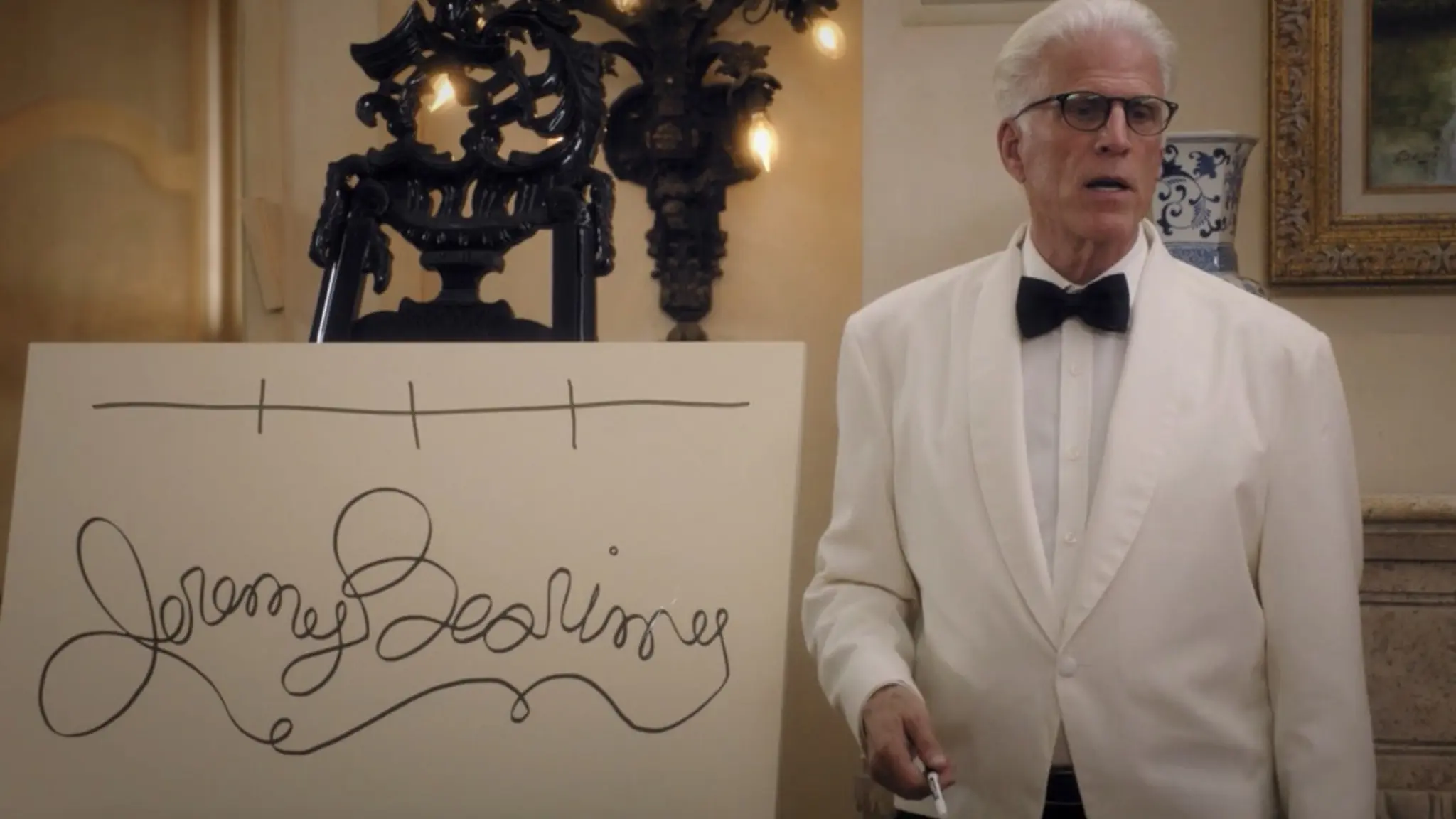
In The Good Place, Michael explains that time in the afterlife isn’t a straight line. He draws it on a whiteboard as a looping scribble that happens to spell “Jeremy Bearimy.” It’s the funniest explanation of nonlinear time I know, and it’s exactly what a time-travel company sells.
Bearimy is a fun nod without being too weird. People who know the show get the joke, and people who don’t just hear a warm, slightly odd name that sounds like it could have been around for a hundred years.
The vibe
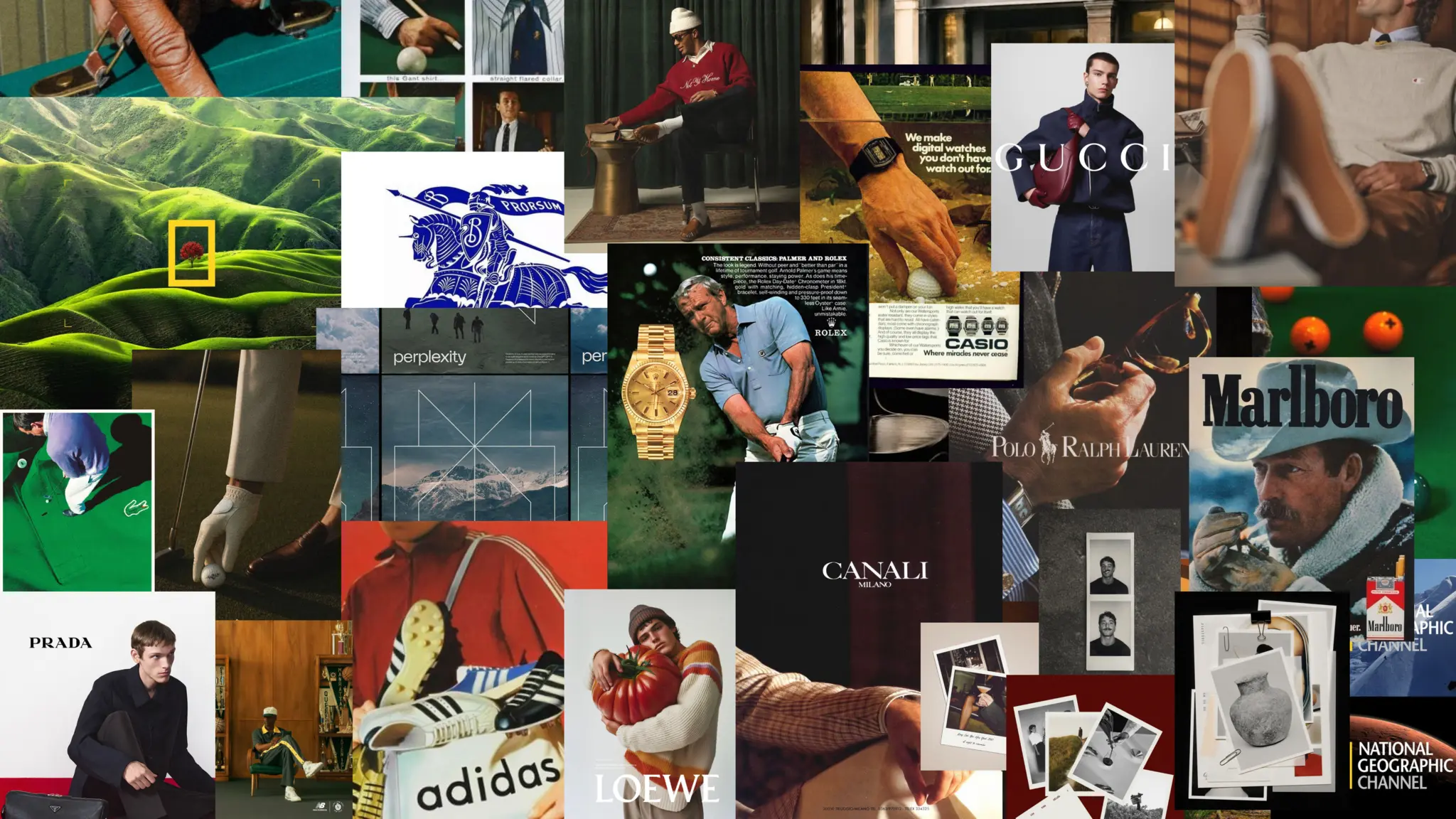
If the technology isn’t the story, the trip is. So I pitched Bearimy as a heritage luxury travel brand, the kind of company that feels like it has always existed, which is a nice trick for one that sells time.
The moodboard pulled from vintage watch ads, golf and pool halls, old-money fashion and travel magazines. Warm film color, grain, tailored jackets and hands. The watches kept showing up, and they became the thread for the whole system: time travel is about time, and a good watch is the oldest way to show you take it seriously. Familiar, classic references also do some of the work of trust. Nobody wants a first-of-its-kind trip to feel experimental.
The logo
The logo at the top of this post is a tall, high-contrast serif in white. It feels like a fashion house, but one letter is off: the I leans over, a shift in the timeline in the middle of an otherwise straight line. The red is there to show power. A company asking you to trust it with your place in history should have a strong presence, not a polite one. The stacked version steps down the page in three rows, BE, ARI, MY, for small square spaces like a profile picture.
The ads
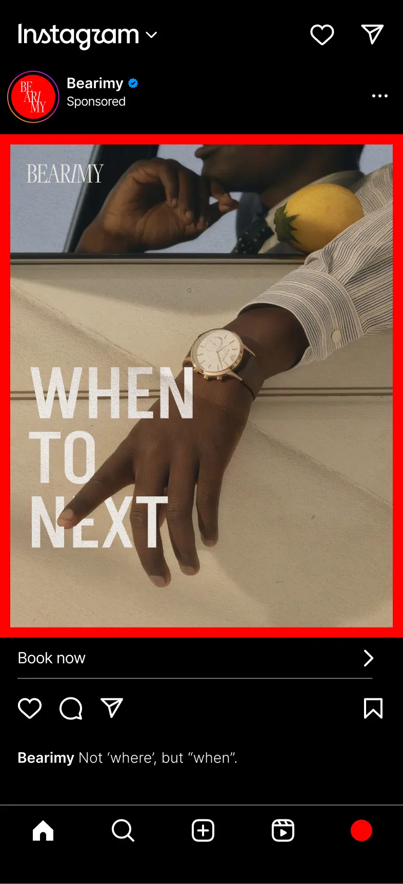
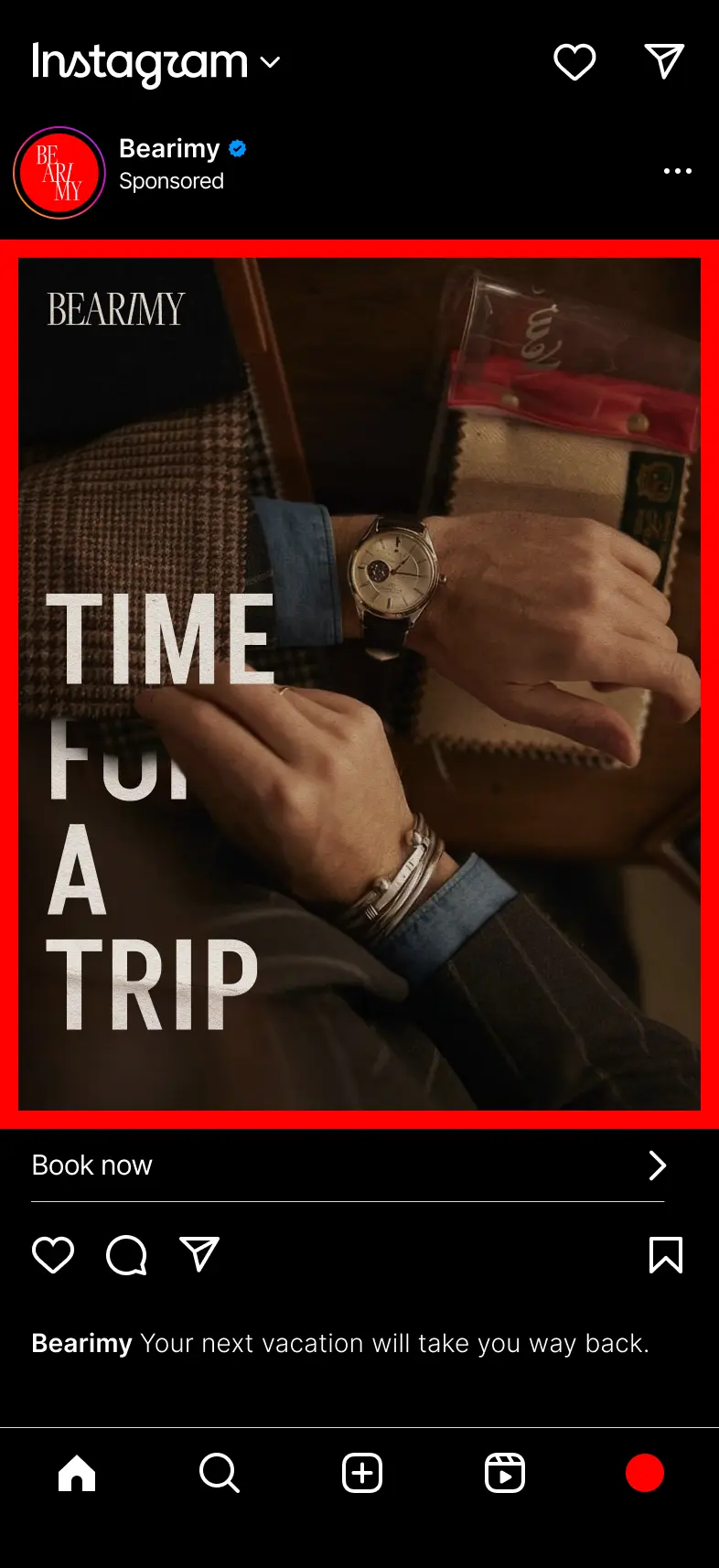

The brief asked for two ads. I made three, because a system only proves itself when it repeats.
Every ad uses the same parts. A warm, grainy photo with a watch somewhere in the frame. The serif wordmark in the top left corner. A short headline in tall condensed capitals, stacked down the left side and tucked behind the hands and objects in the photo, so the type feels like part of the scene instead of a sticker on top. A thin red frame ties each one back to the logo.
The lines do the selling in as few words as possible. “When to next” swaps the travel question you expect for the one only Bearimy can answer, and the caption says it plainly: not where, but when. “Time for a trip” and “When you’re ready” keep the jokes about time light enough that the ads still read as a vacation you could actually book.
What I’d take from it
Defining a brand from very little mostly means saying no. The naming board was useful for the names it ruled out: too sci-fi, too expected, too much like someone else. Once Bearimy stuck, every other choice had something to answer to. Does it feel like it’s been around forever, and does it make time feel like a luxury?