[EVENT BRANDING]
CKO: Strong Past, Strong Future
The identity for Lucid’s Company Kick-Off: a bubble-letter logo, a hype video, signage and swag.
Every company has a version of the first-day-of-school feeling. At Lucid, it’s the Company Kick-Off, or CKO: the annual moment where everyone stops, looks back at the year we just had, and lines up behind the one ahead.
As part of Lucid’s internal creative team, I led the creative direction for CKO, working with executive leadership and the event production team to turn the company’s message into a visual system. That meant everything from the logo to the hype video to the sweatshirt you’d end up wearing for the next six months.
The brief
The rally cry was already set: “Strong Past, Strong Future.” My job was to give it a look.
That sounds simple until you remember who the audience is. A kick-off has to work for teams around the world, in person and on screen, for people who have seen a lot of kick-offs. The identity had to do three things:
- Align global teams around one message.
- Energize people enough to actually show up and care.
- Set the tone for the new fiscal year, in physical and digital spaces alike.
Corporate events have a habit of looking like corporate events. I wanted this one to look like something people would want to put on their laptop.
The logo
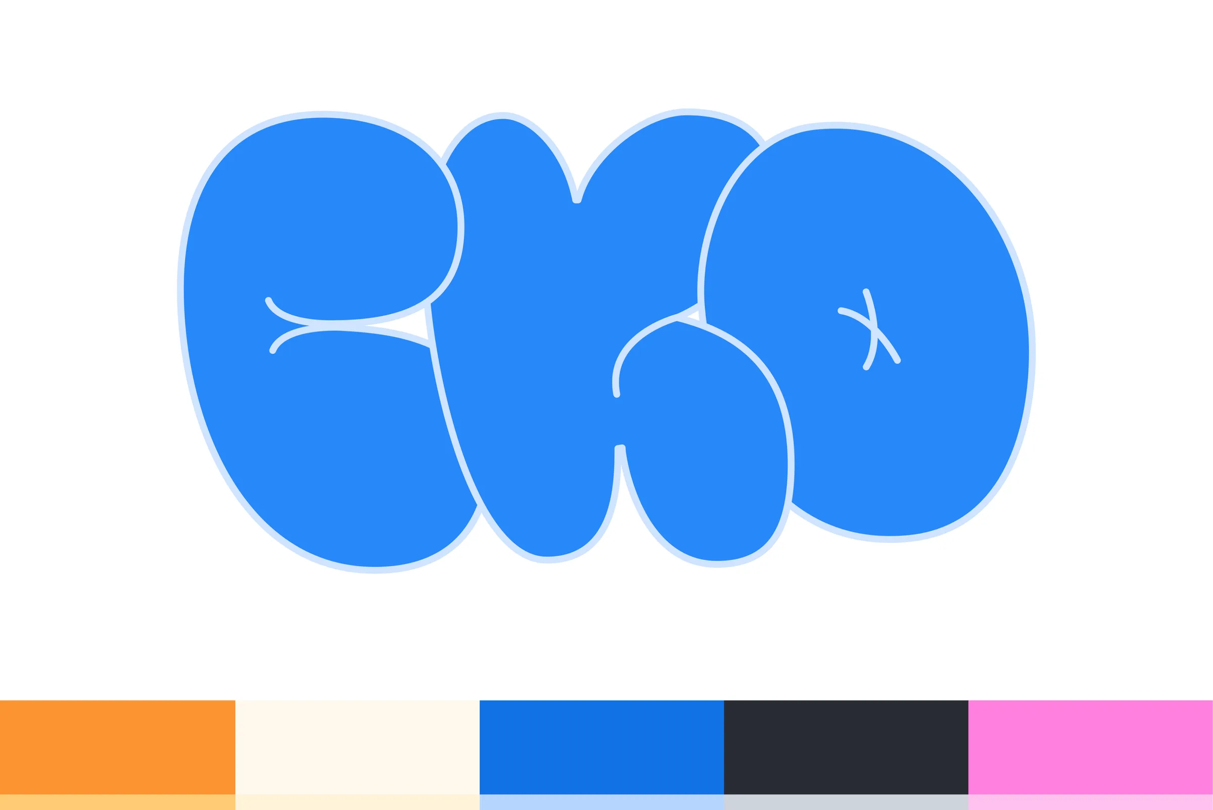
The answer was a bold, bubble-letter “CKO.” Three letters, squished together like they’re all trying to fit in the same photo. It’s loud, a little goofy, and impossible to read as “just another all-hands.”
The rally cry does the serious work. “Strong Past, Strong Future” sits above and below the mark in a heavy, no-nonsense sans, so the pairing reads as confident first and playful second. The logo gets to have the fun.
Around it, I built a vibrant, high-contrast palette (orange, cream, a bright blue, charcoal and pink) plus a kit of playful graphic elements: grids, squiggles, arrows and a cursor or two. Together they give the system enough range to go from a slide to a wall without losing its personality.
The hype video
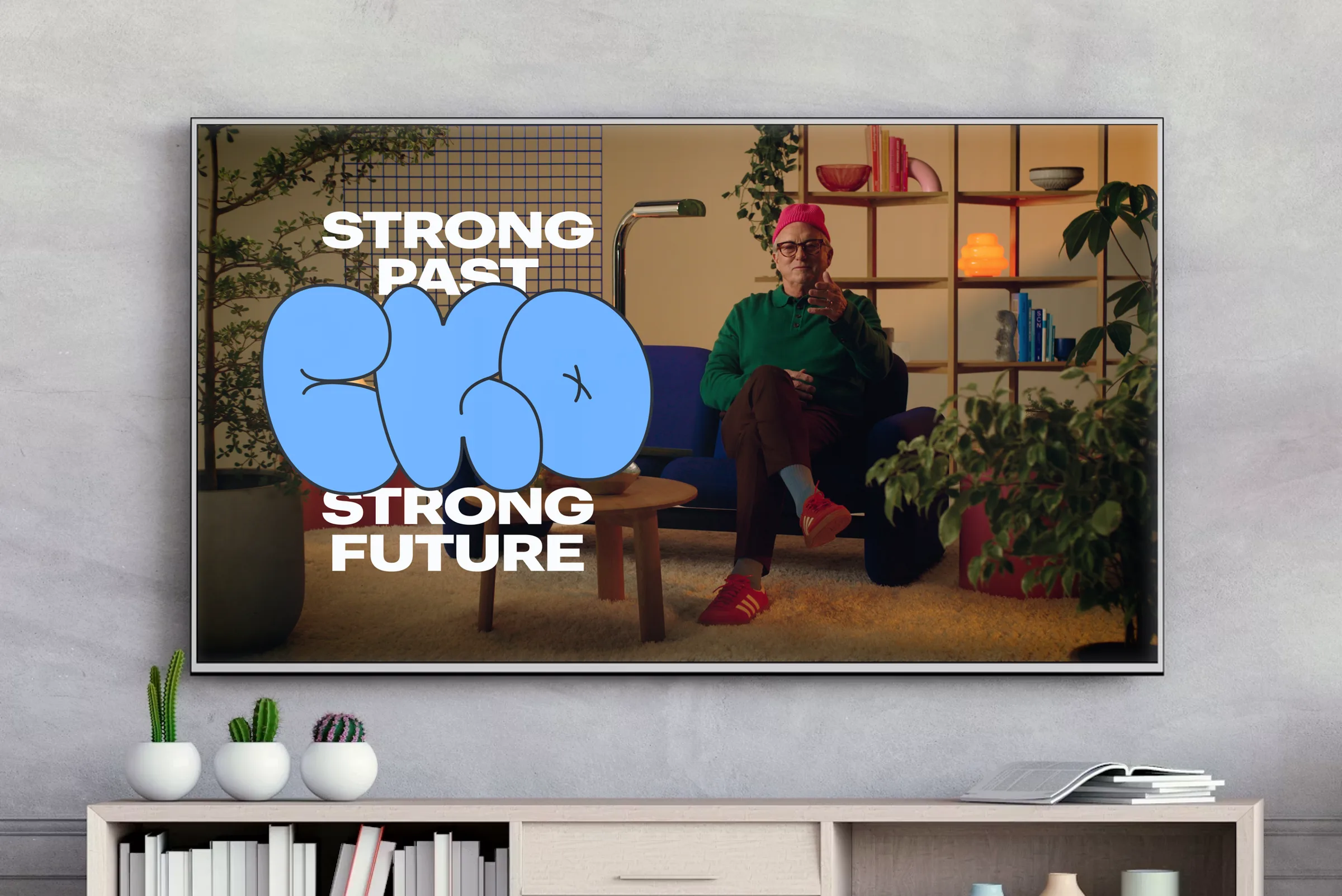
No kick-off is complete without a hype video. I concepted and art directed the visual direction for the executive hype video, which ran in the lead-up to the event to build anticipation.
The goal was to make the identity feel at home on top of real footage. The bubble letters and bold type sit right over the scene, so even a quick glimpse of the video tells you exactly what it’s for.
The space
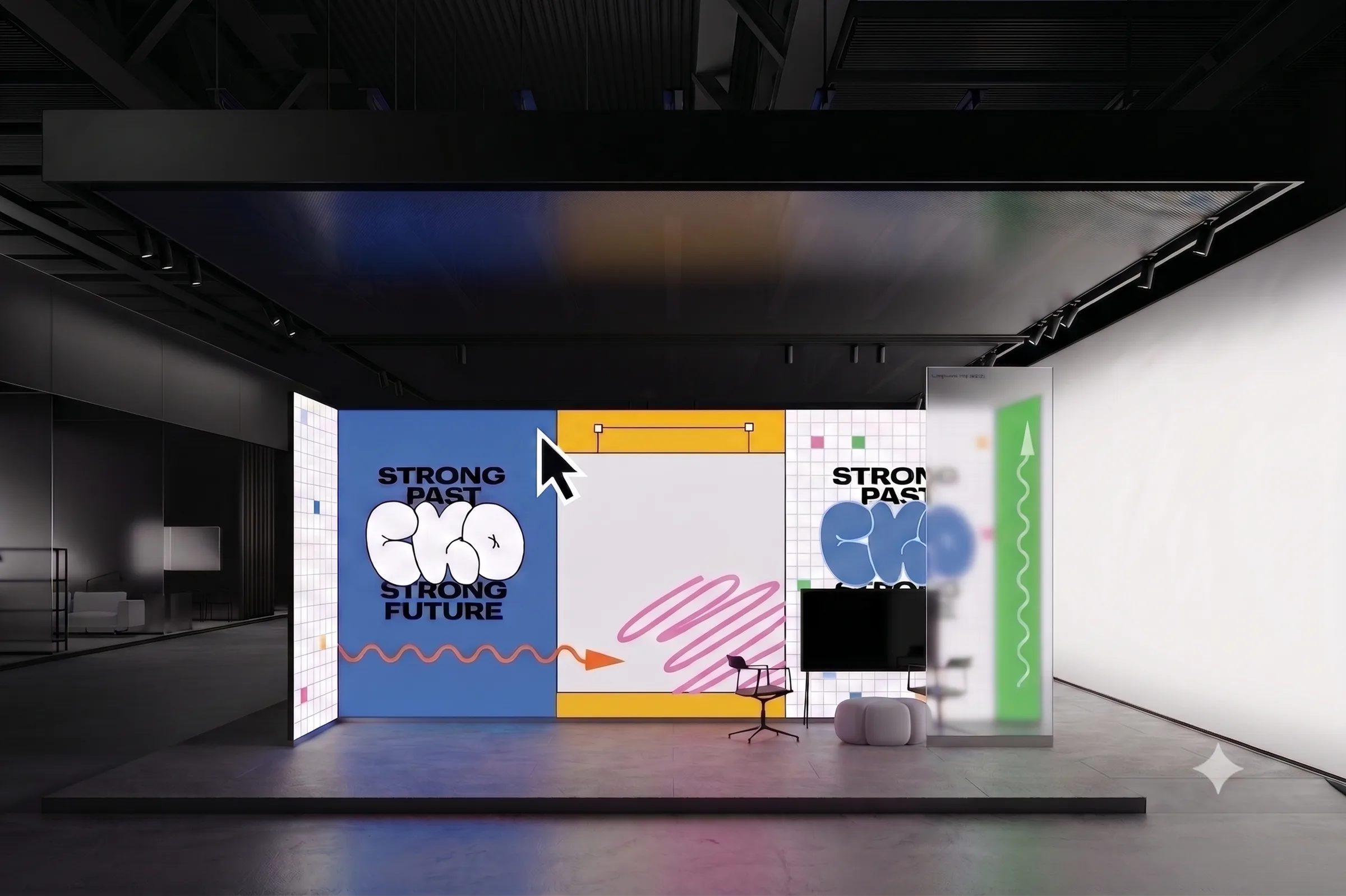
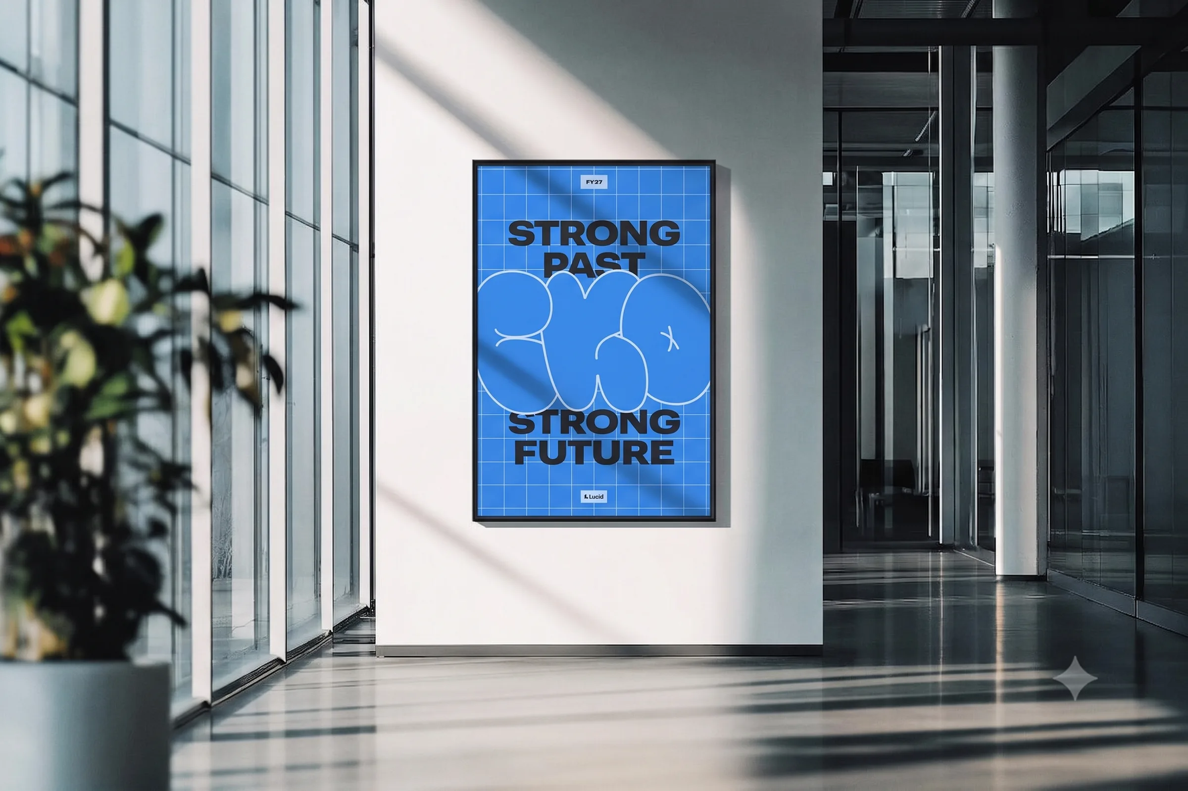
An event identity really gets tested when it leaves the screen. I designed the physical environments, from interactive booth setups to large-format signage.
The booth breaks the system into big, bold panels: one blue, one yellow, one white grid, each carrying a piece of the story. Up close, the details (squiggly arrows, a giant cursor, little pops of color on the grid) reward anyone who stops long enough to take a selfie. From across the room, the CKO mark does all the talking.
The posters take the opposite approach: one color, one grid, one message, stacked so it reads in the time it takes to walk past.
The swag
Swag is the part of an event people actually take home, so it has to be something they want to take home.
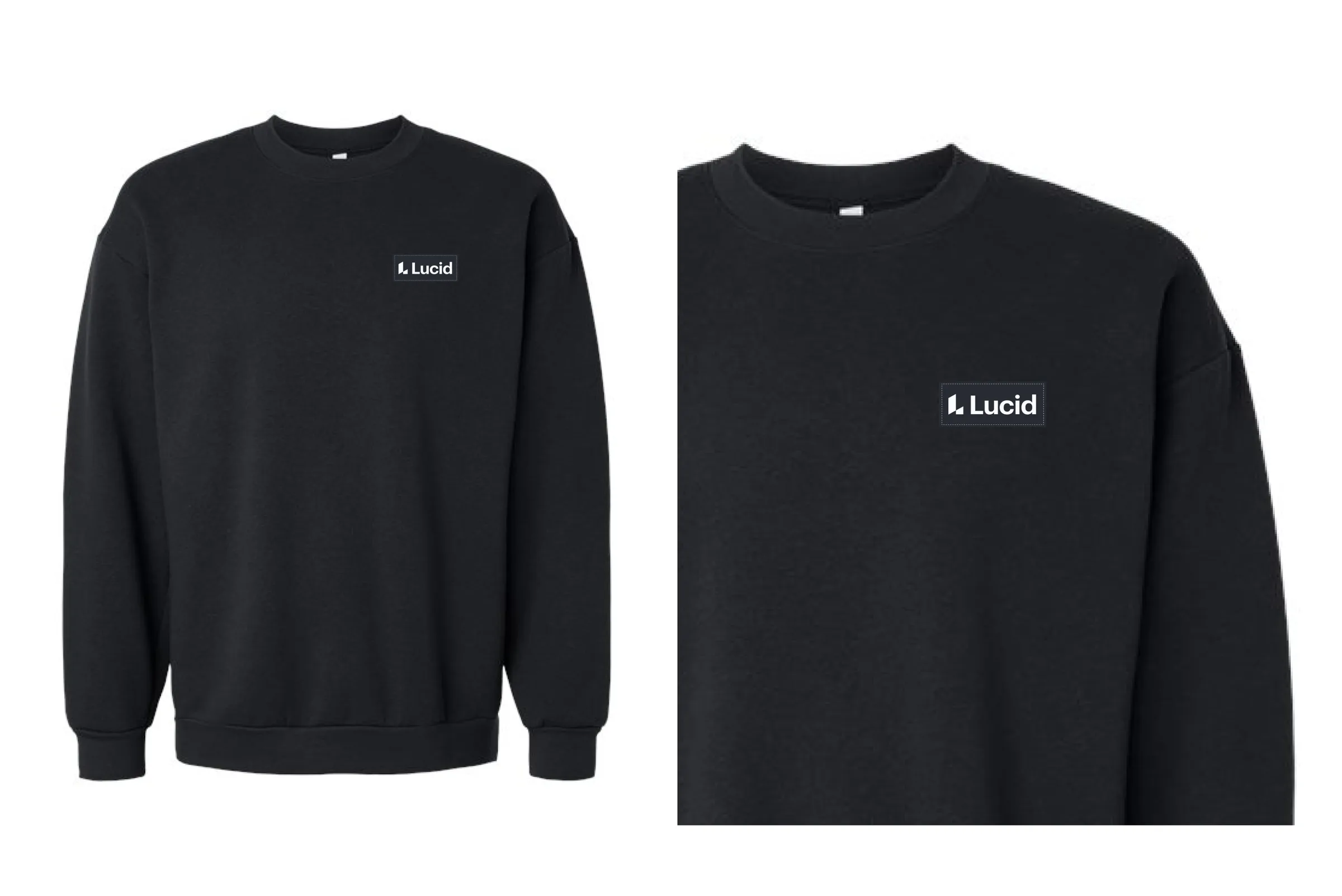
For apparel, I went quiet: a black crewneck with a small Lucid patch. It’s the kind of sweatshirt you wear because it’s a good sweatshirt, not because you were at an event.
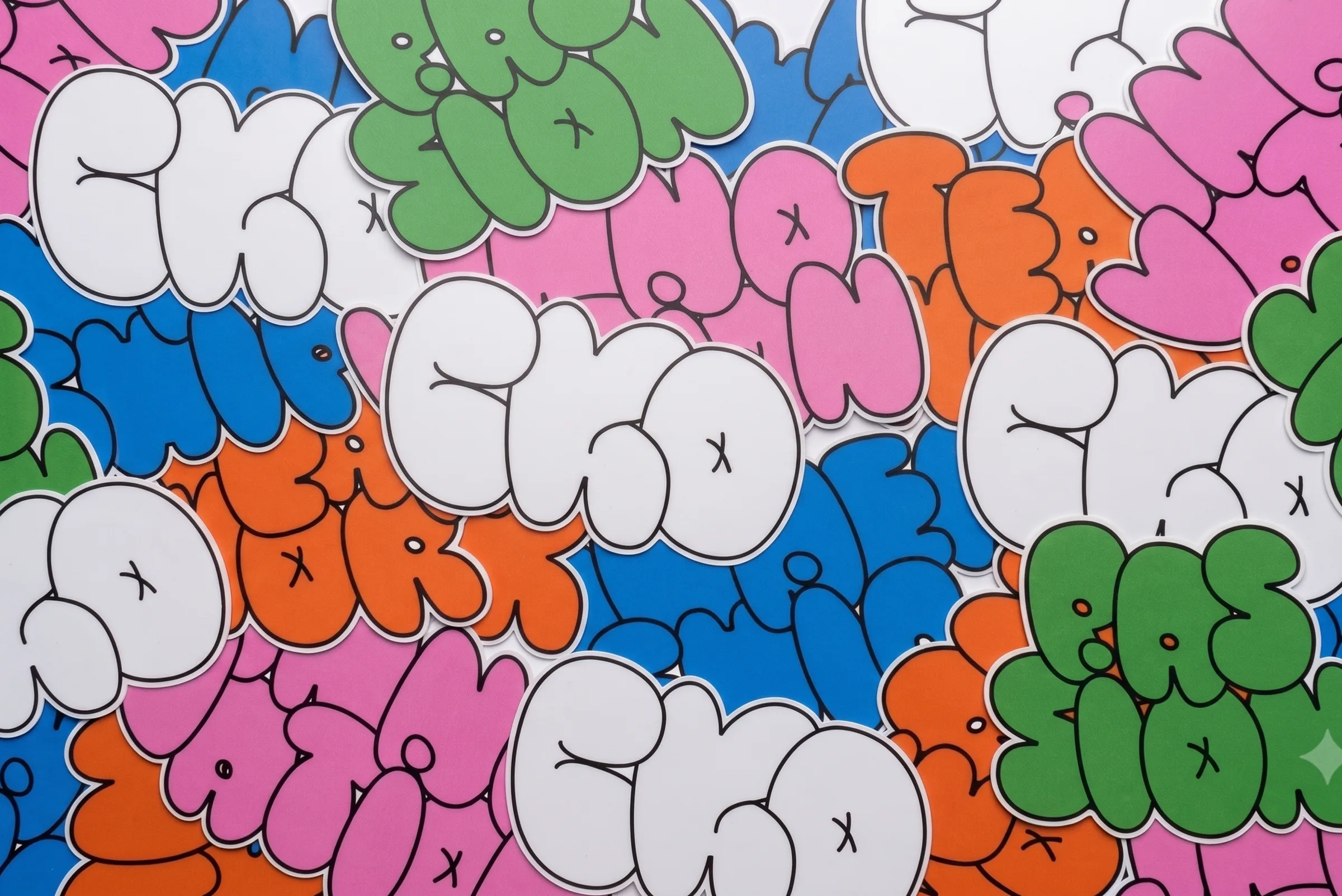
The stickers are where the bubble letters got to be loud again. The same lettering style stretched beyond “CKO” into a whole set of words in every color in the palette.
The toolkit
The last piece is the least glamorous and maybe the most important. An event like this involves a lot of teams making a lot of things, and not every one of them can go through a designer.
So I built a scalable event toolkit: slide frameworks, digital signage and internal promotional graphics, ready for anyone to use. That way the identity stayed consistent across every team, whether a designer touched the file or not.
The takeaway
CKO was a reminder that internal branding deserves the same care as anything customer-facing. The people in the room are the ones who carry the message out of it.
“Strong Past, Strong Future” could have been a slide title. Instead, it became a logo, a video, a booth and a pile of stickers. That’s what I love about event work: you get to take one sentence and build a whole world around it.