[EDITORIAL DESIGN]
The Impact Book: 100 Pages of Thank-You Notes
A yearly booklet of messages from people Impact Suite’s apps helped, designed for the team and stakeholders.
- At Impact Suite, Ryker designed the Impact Book, a 100+ page yearly booklet of gratitude messages from people who used Impact Suite's mental health apps.
- The apps help people overcome addictions and compulsive sexual behavior and manage anxiety and depression.
- The book went to the team and stakeholders as a reminder of the company's culture of making big changes through small daily steps.
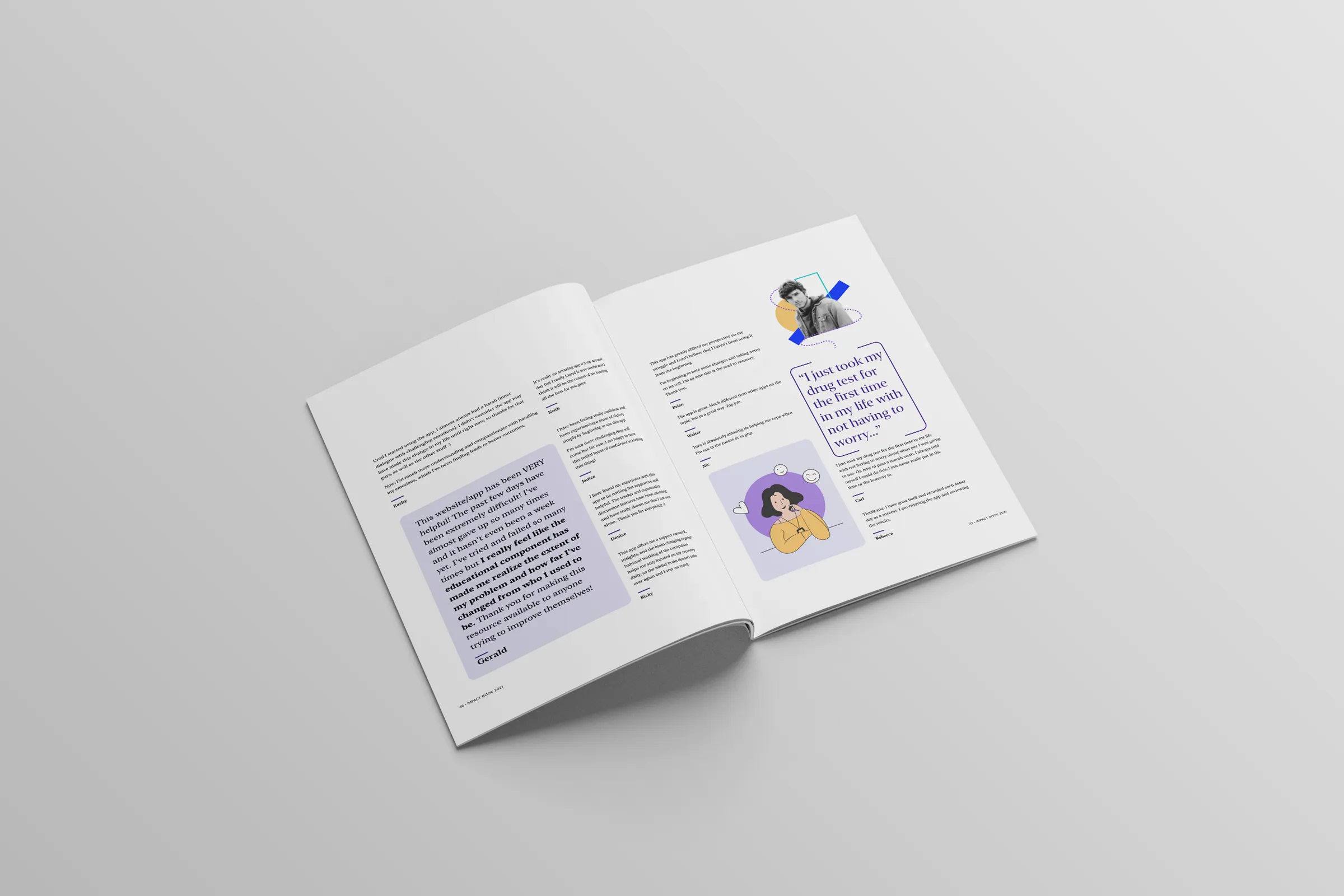
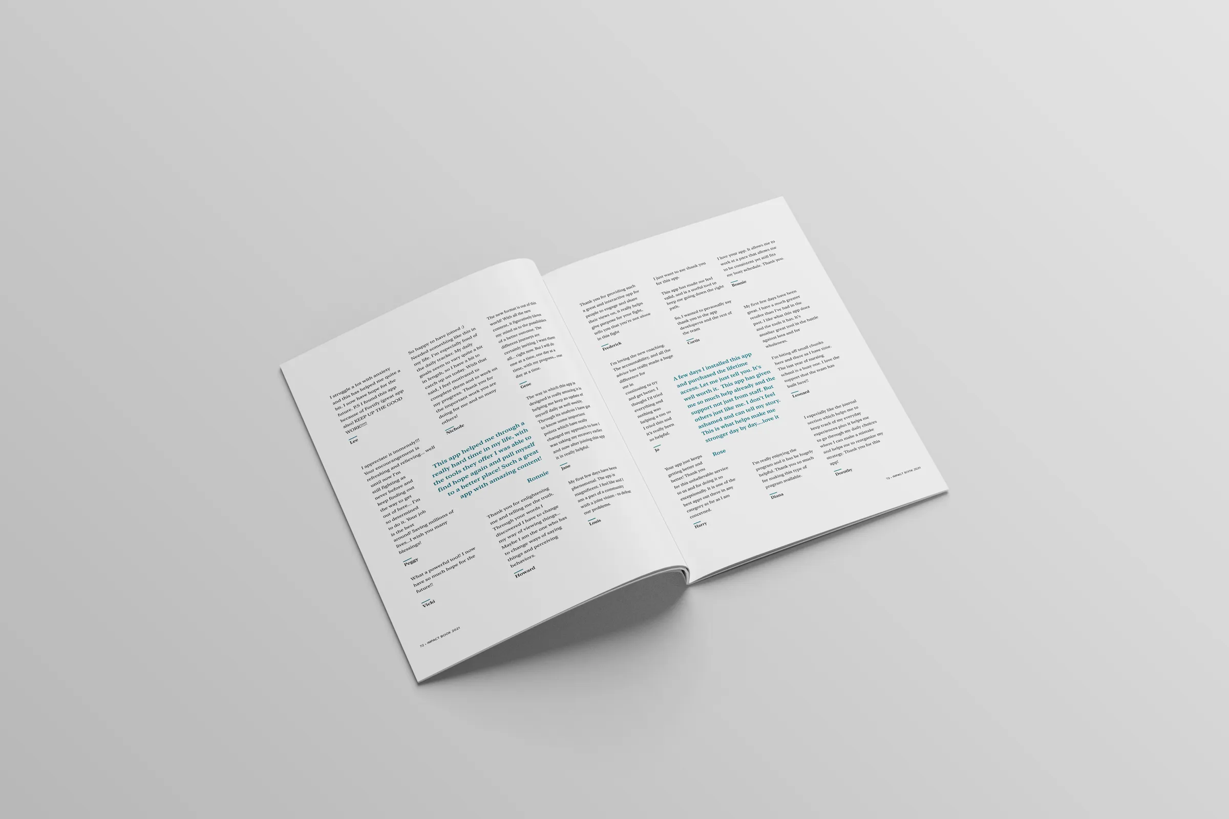
- The layout pairs quiet, airy pages and soft illustrations with large pull quotes so the messages carry the book.
Summarized by AI from this page. The long version is below.
Most companies measure impact in a dashboard. Impact Suite also measured it in a book.
Impact Suite’s apps help thousands of people every year overcome addiction and compulsive sexual behavior, and manage anxiety and depression. Every day, some of those people write in to say thank you. At the end of each year, we gathered those messages into a booklet of more than 100 pages and shared it with the team and our stakeholders.
I designed it.
Why it mattered
The Impact Book wasn’t a marketing piece. Nobody downloaded it in exchange for an email address. It was for us.
It was a big part of the company’s culture: the idea that small steps every day add up to real change in someone’s life. When you build software all day, it’s easy to forget there’s a person on the other end. This book put a hundred pages of them on your desk.
The approach
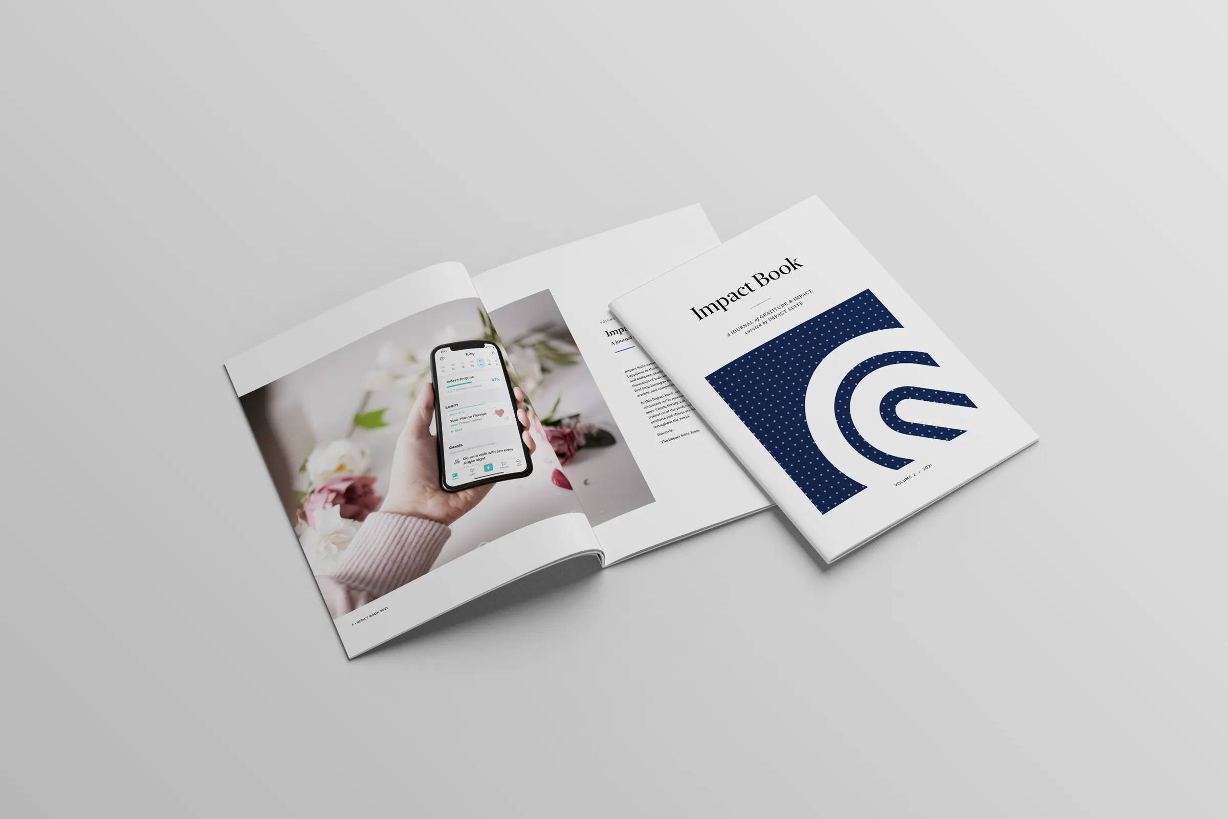
The cover keeps it simple: a navy panel with the Impact Suite mark, and a photo of the app in someone’s hand to open the book. When the content is this personal, the design’s job is to get out of the way. I kept the pages quiet and airy, with plenty of white space, so every message had room to breathe.
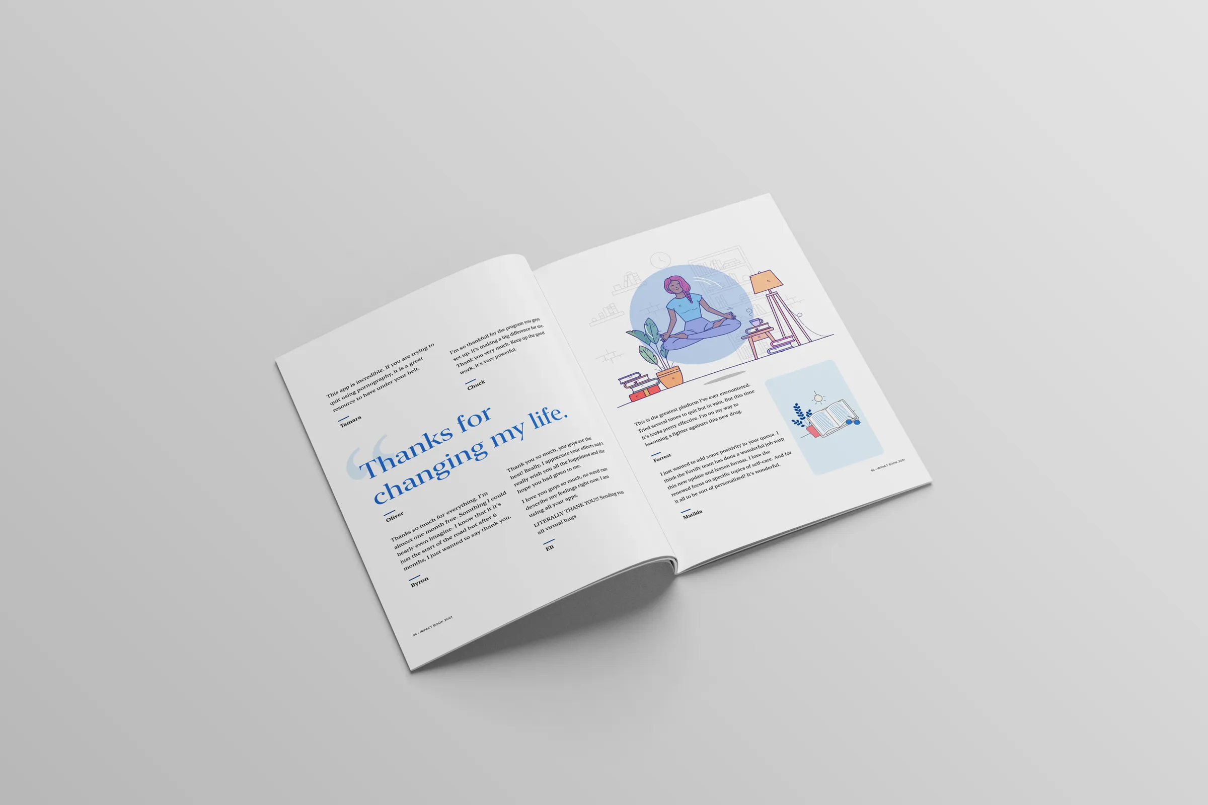
- Big pull quotes for the lines that stop you, like “Thanks for changing my life.”
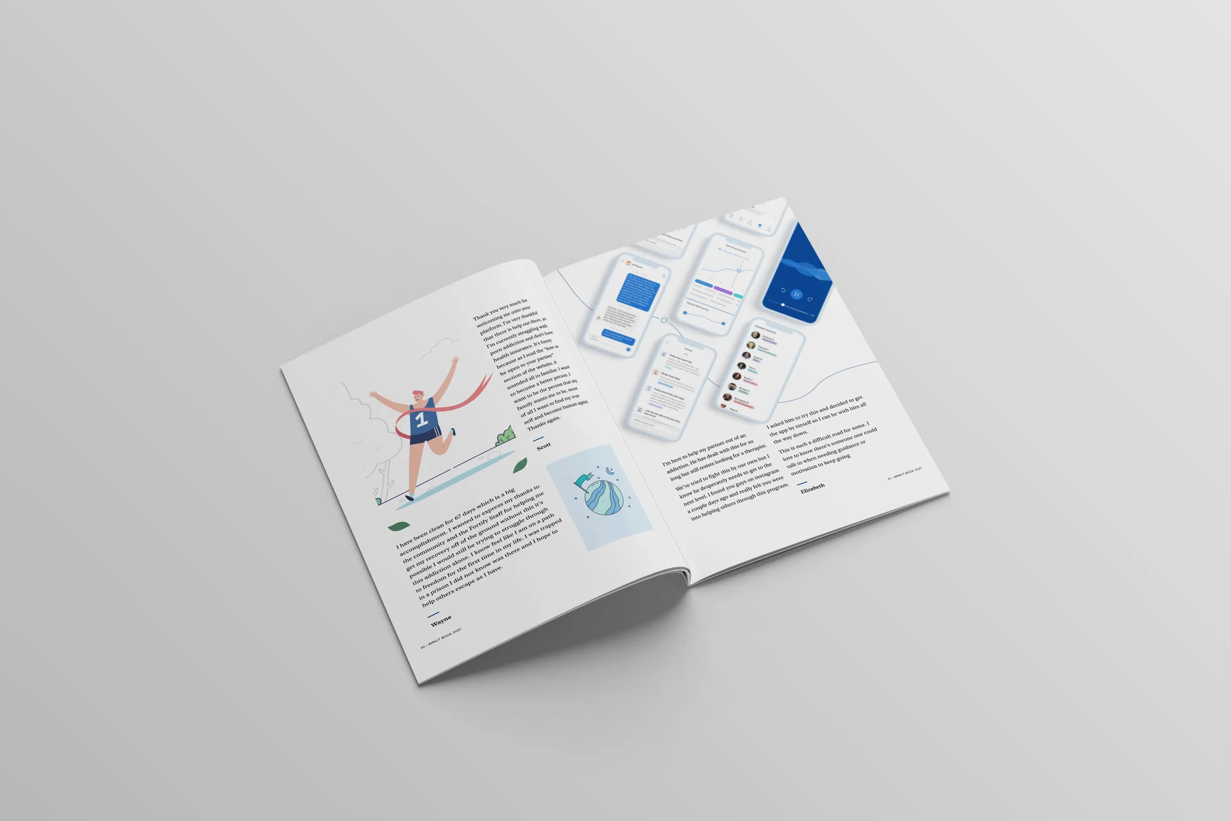
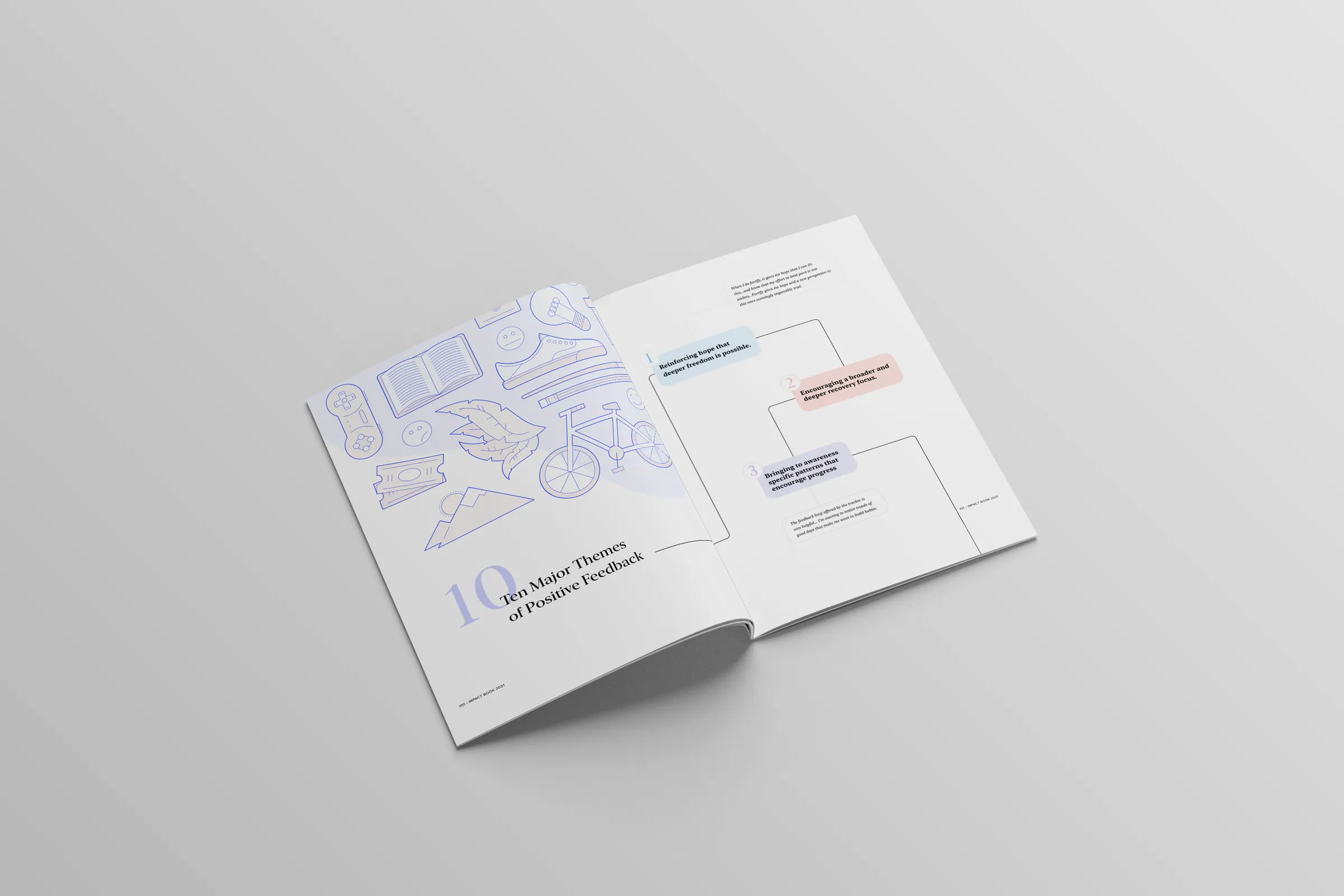
- Soft, friendly illustrations to break up long runs of text without making the book feel clinical.
- App screens in a few places, so readers could connect the messages to the product the team builds.
- A themes section that sorts the year’s feedback into the ten major themes that came up again and again.