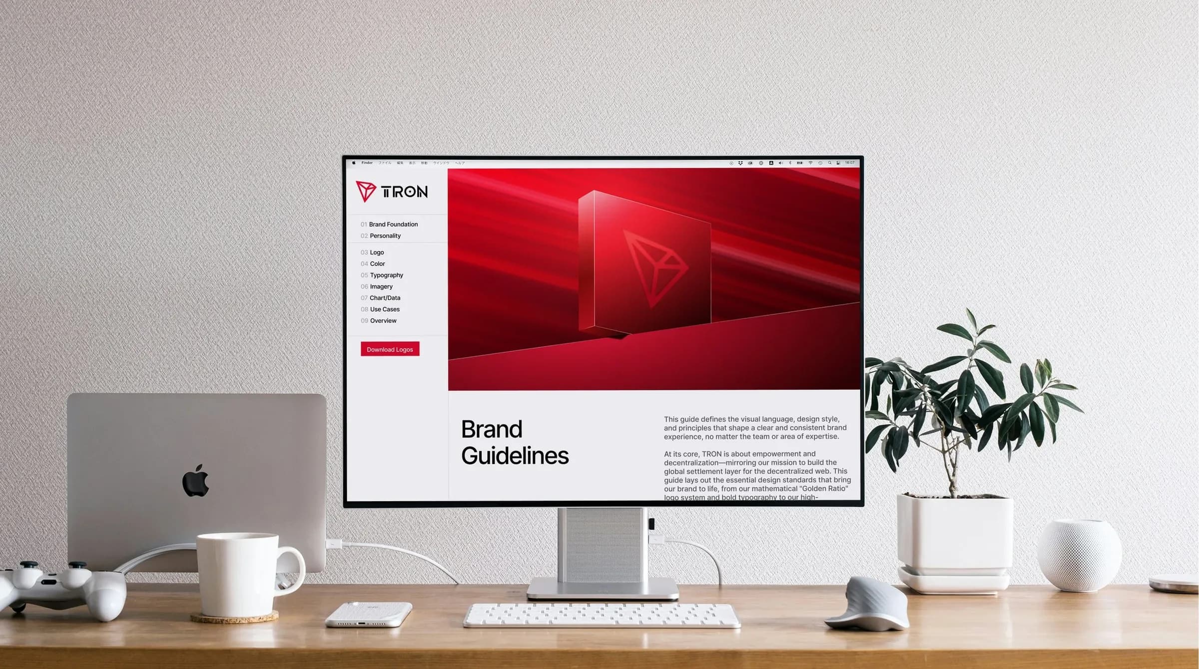
TRON DAO: a brand system that runs without me
From a fragmented, one-designer bottleneck to a guidelines system the US and global teams can use on their own.
- As a contract brand designer for TRON DAO, Ryker inherited a fragmented system that depended on one designer after a CN-team micro-rebrand.
- With the lead US brand designer, he audited every asset from both regions in FigJam and presented the gaps to leadership.
- They distilled the brand into nine guideline categories, built as a living Figma Sites hub plus componentized Figma libraries.
- Result: events, dev, ops and design teams all build from the system, and a simplified external guide keeps brand partners consistent too.
Summarized by AI from this page. The long version is below.
- [ROLE]
- Brand Designer (contract)
- [CLIENT]
- TRON DAO
- [YEAR]
- 2025–2026
[The problem]
I joined TRON DAO as a contract brand designer to help evolve the identity. Right as I started, a miscommunication between the US and China teams led the CN team to launch a micro-rebrand. The result was a piecemeal system that was hard to scale, and the whole US brand operation depended on one internal designer. Rather than wait it out, we used the moment to give the brand real structure.
[The audit]
Justin Yee, the lead US brand designer, and I pulled every asset, social post, deck and visual reference from both regions into one FigJam board. Side by side, the problem was clear. Individual graphics looked great, but the visual language had no shared rules. We took the board to leadership to show where the inconsistencies were slowing teams down, and agreed on a direction that kept the momentum of the recent update while adding the structure it was missing.
[Nine categories]
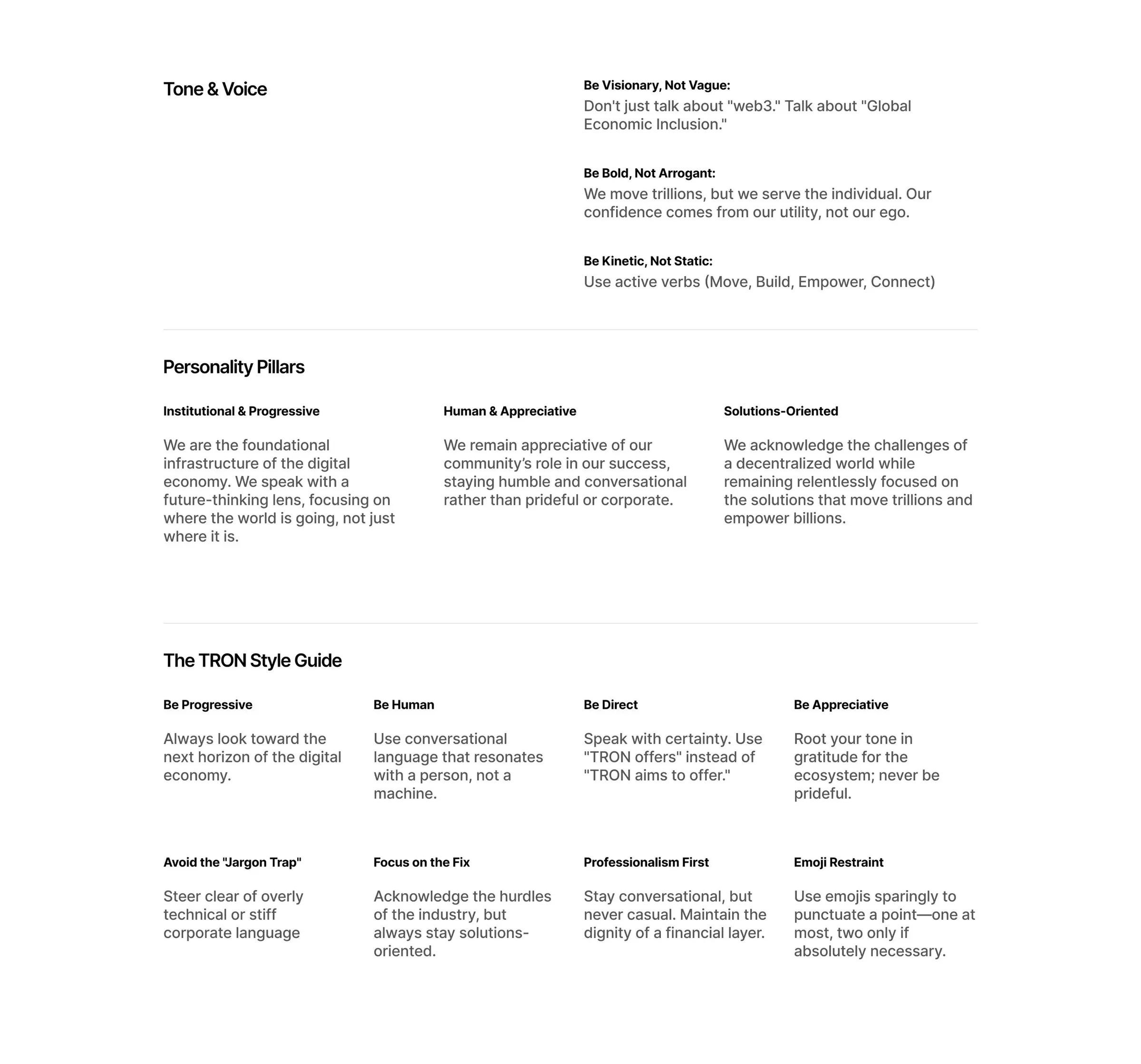
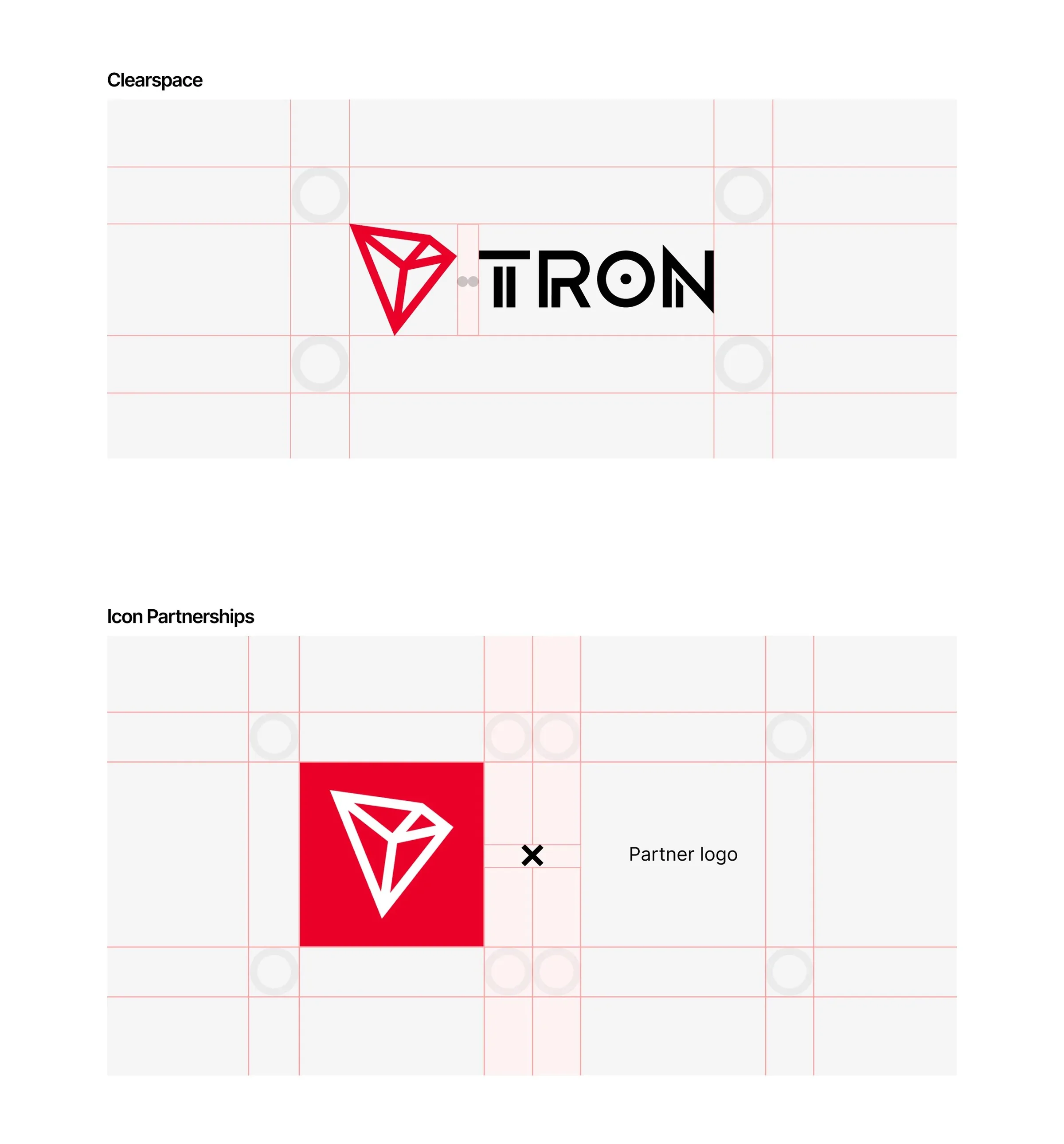
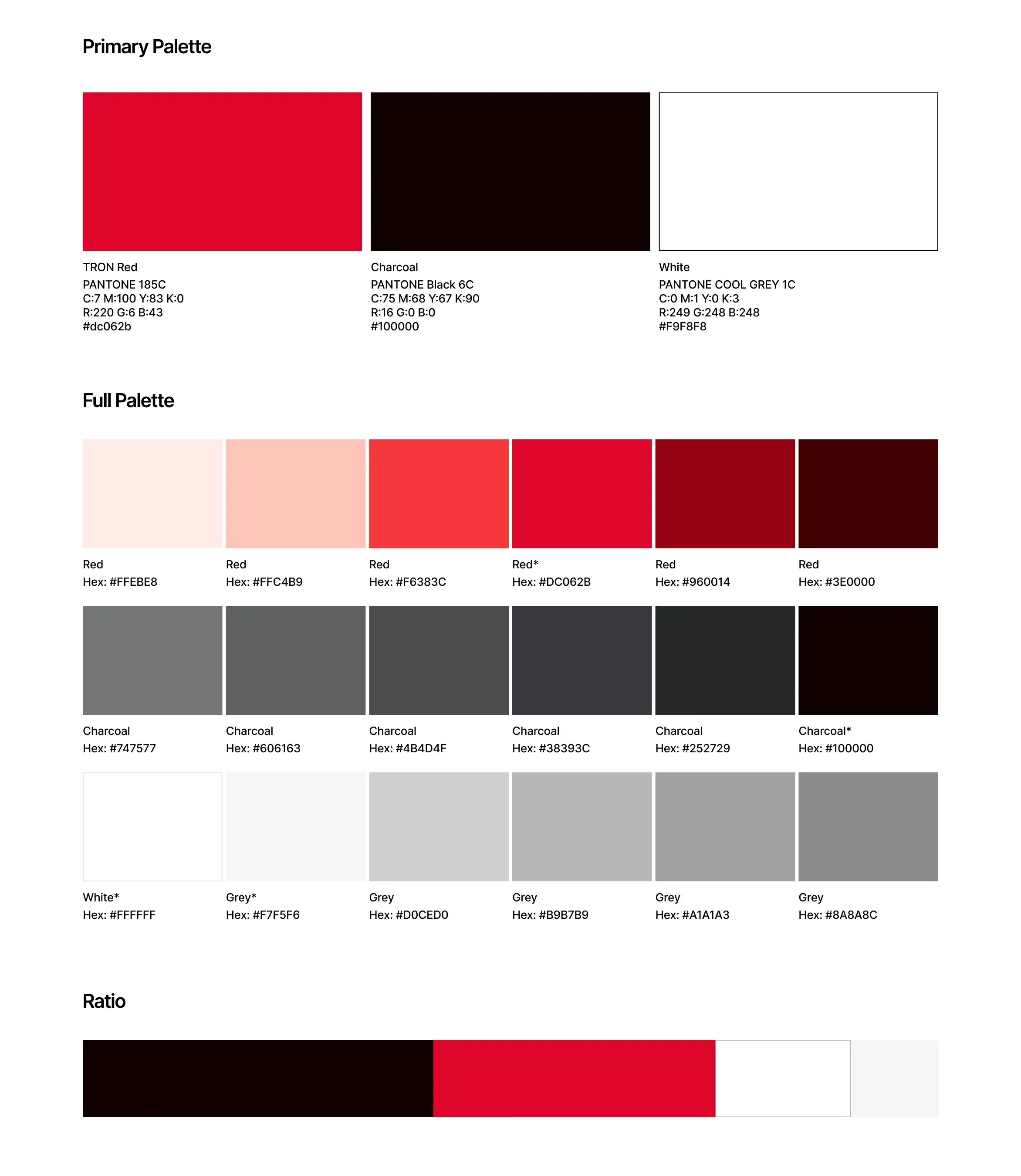
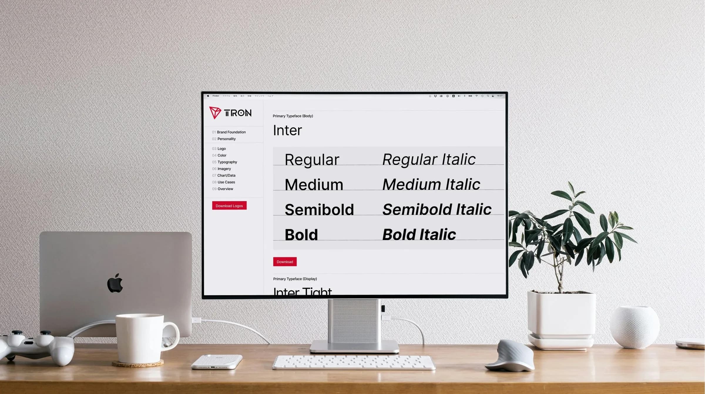
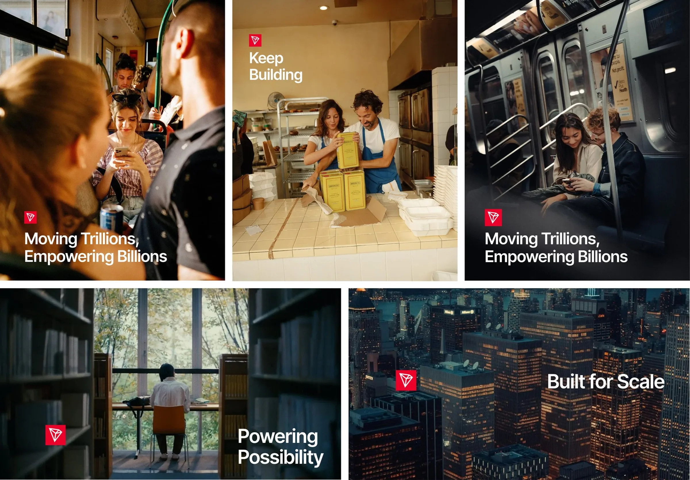
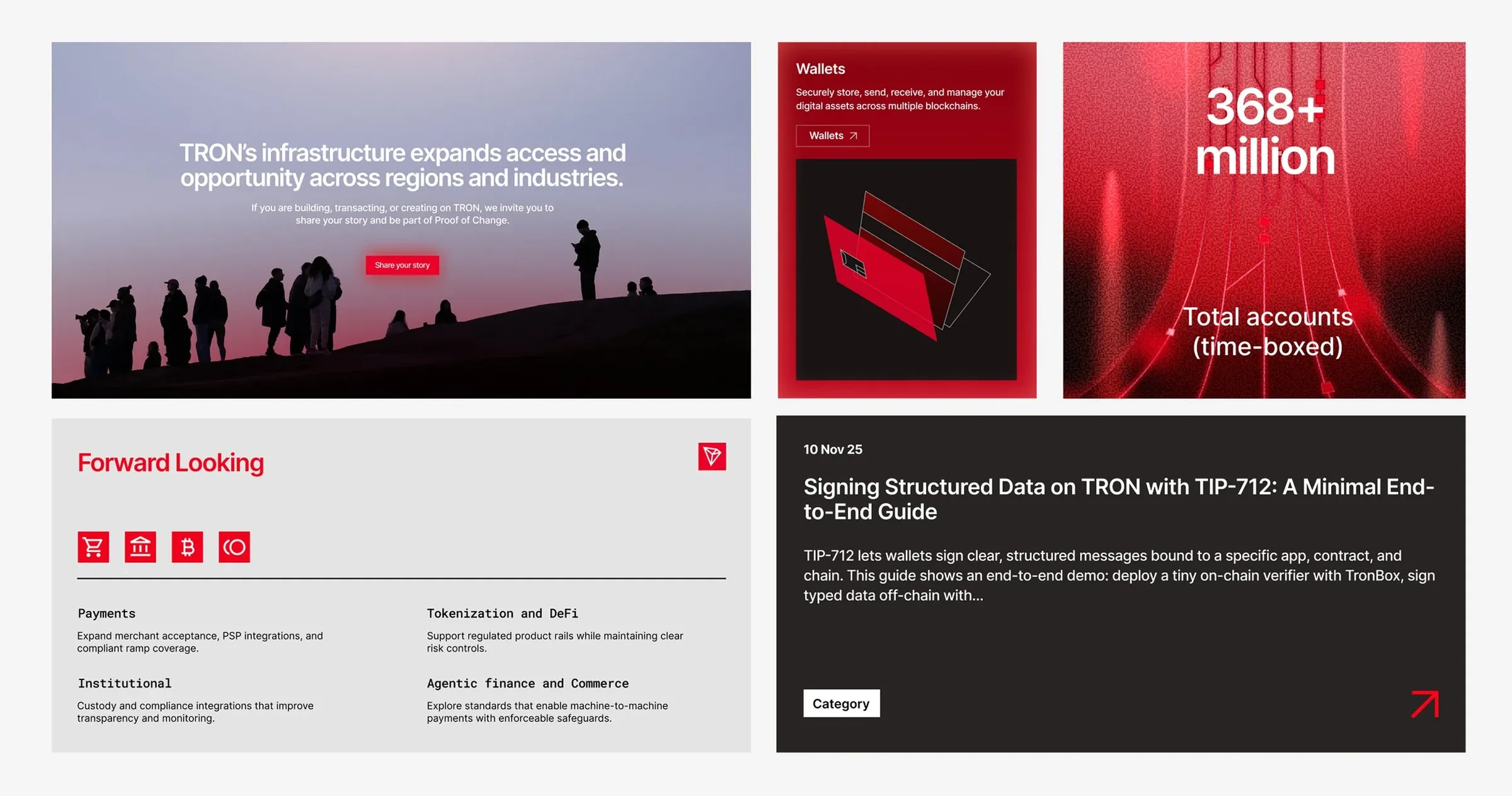
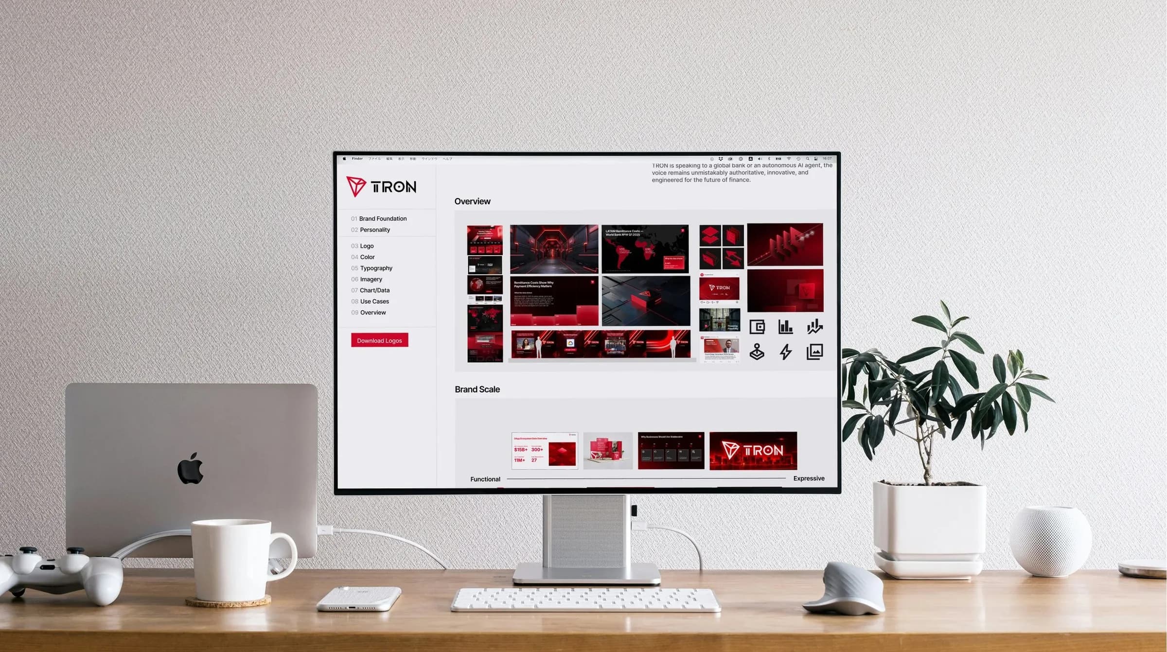
We distilled the guidelines into nine categories. The first, Brand Foundation & Strategy, sets the narrative pillars that every piece of work, from summit graphics to developer posts, anchors back to. The rest turn those pillars into rules a designer, vendor or agency can follow without asking.
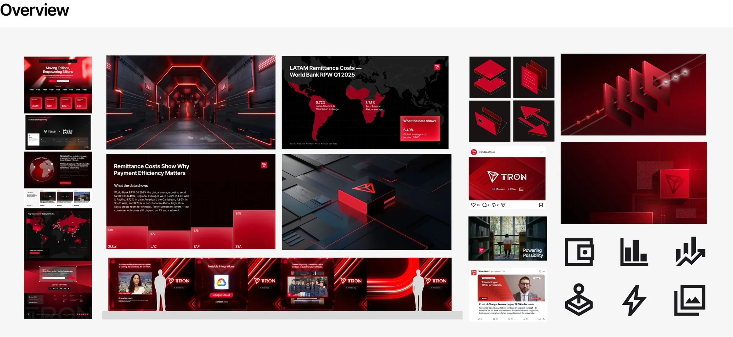
[A living guidelines site]
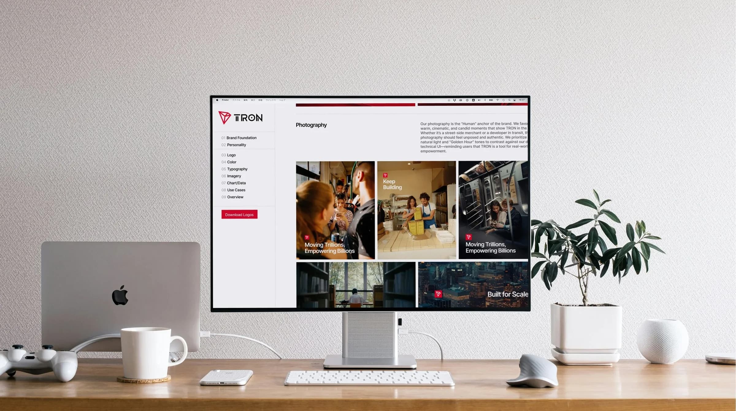
A PDF goes out of date the moment it's exported, so we built the guidelines as an internal Figma Sites hub that updates in real time. Once leadership and legal signed off, we turned the rules into componentized Figma libraries: evergreen templates, assets and UI elements ready to use.
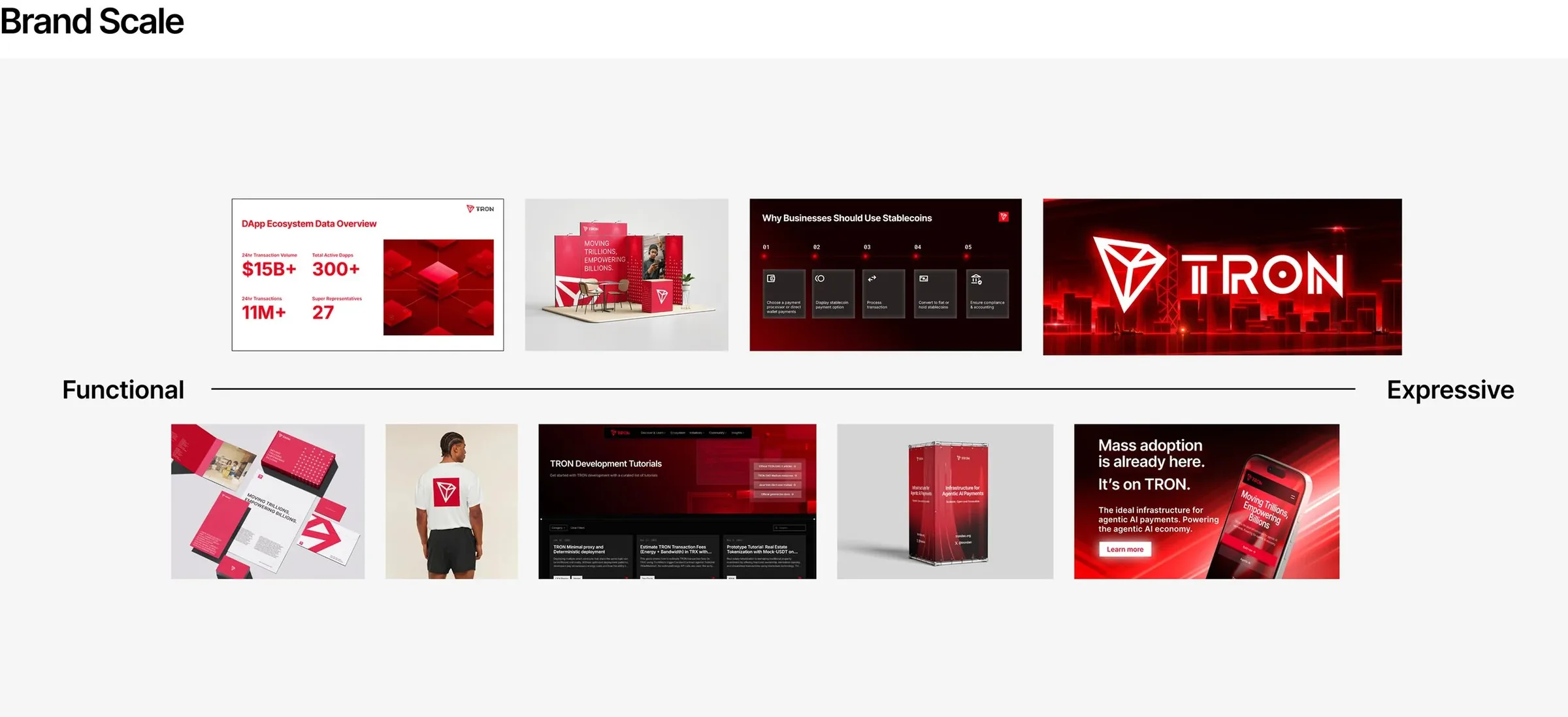
[The outcome]
The brand went from a fragmented, one-designer bottleneck to an organized system that scales. It's used well beyond design: events, dev and ops teams all build from it. A simplified, external-facing version gives brand partners and agencies the same rules without the internal detail.