[DIGITAL DESIGN]
Ads, Videos and Hundreds of Tiny Thumbnails
Video ads, paid display campaigns and a template thumbnail redesign for Lucid.
- A collection of Ryker's digital work at Lucid.
- He storyboarded video ads and worked with motion designers and content writers to bring them to life.
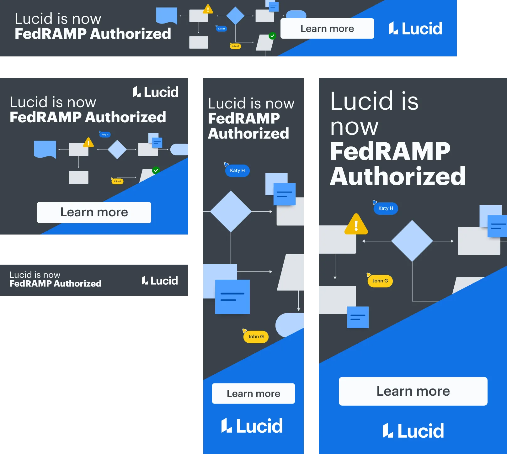
- He designed paid display ad sets for B2B campaigns, from Lucid's FedRAMP authorization to general growth campaigns.
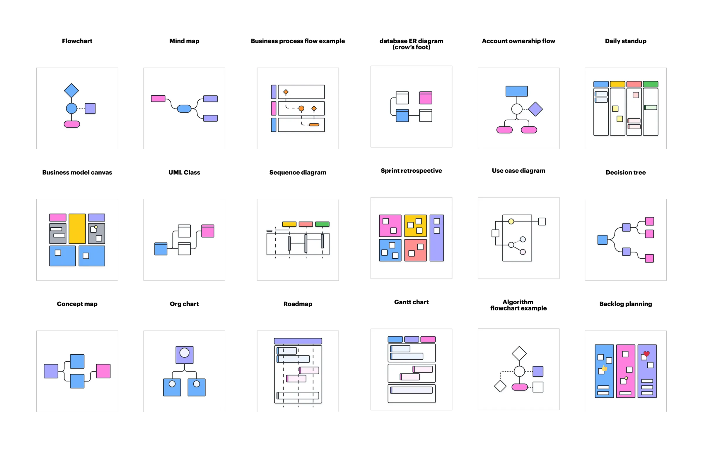
- He redesigned Lucid's most popular template thumbnails and gave art direction for hundreds more, replacing cluttered screenshots with simple, consistent illustrations.
Summarized by AI from this page. The long version is below.
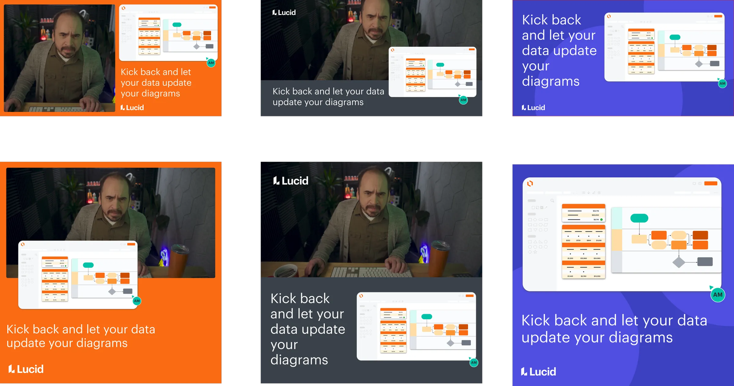
Some of my favorite projects are big launches. Some are small rectangles that show up in your LinkedIn feed. This post is about the rectangles.
Video ads
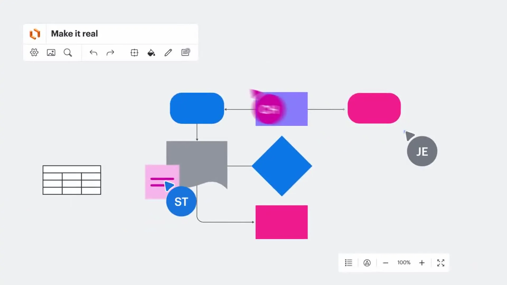
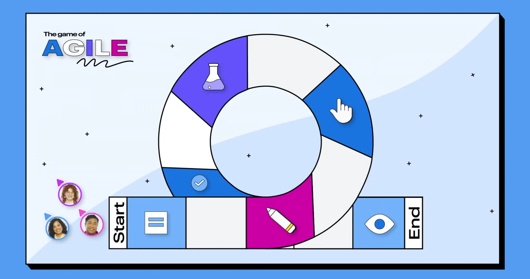
From storyboards to working with motion designers and content writers, video ads have become one of my favorite ways to tell a story. A good one has to land the idea before someone scrolls past, so every frame needs a job.
Display ads
B2B marketing runs on paid media, and paid media runs on sets. One idea has to work as a skinny skyscraper, a wide leaderboard, a square and a LinkedIn post, without falling apart at any of them.
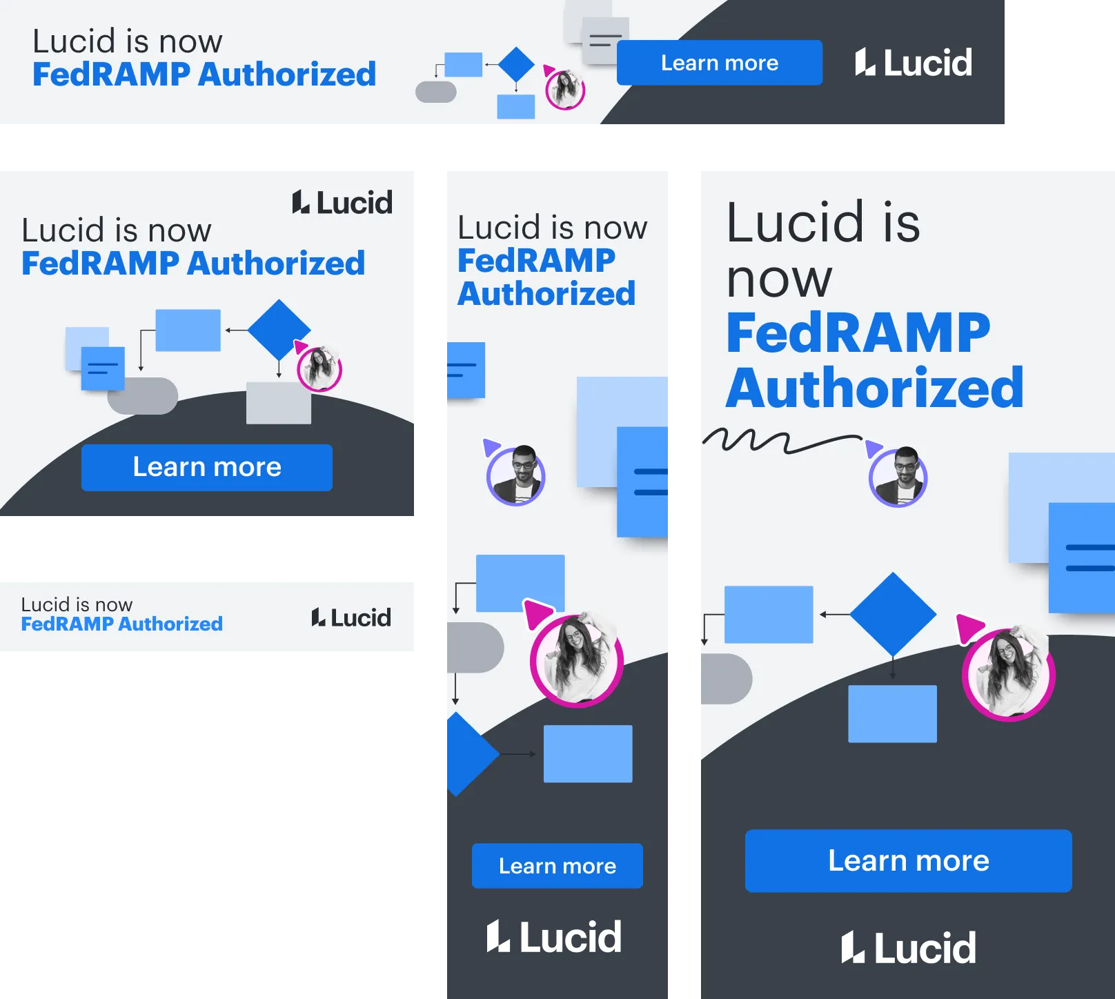
The FedRAMP set had a simple job: tell government buyers Lucid was now authorized. The headline does all the talking, and a small diagram with collaborator avatars keeps it from feeling like a press release. I made a dark version too, for placements where light ads would disappear.
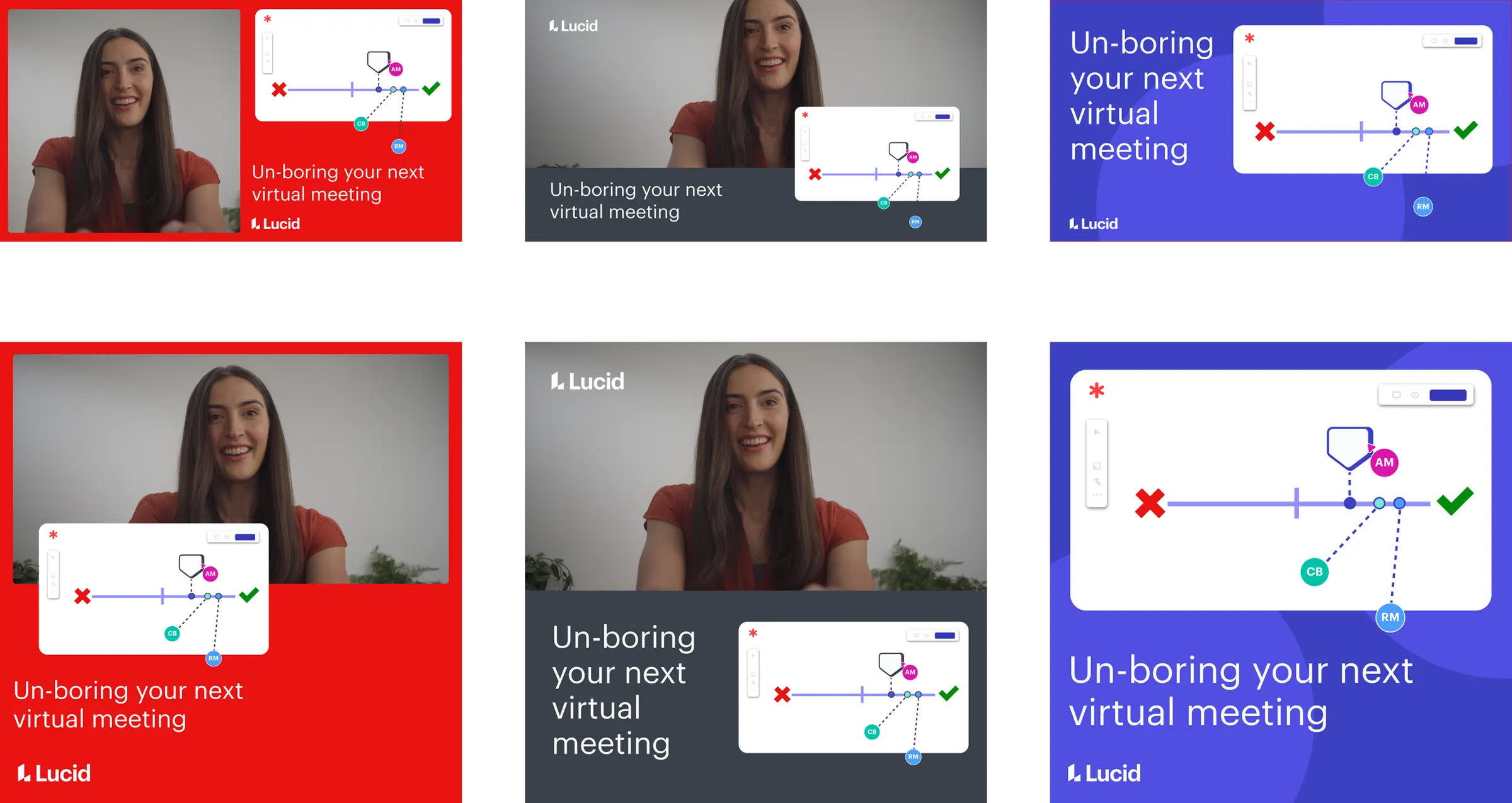
The growth campaigns could be more playful. Each set pairs a real person with a piece of the product, and the line stays short enough to read at a glance.


Template thumbnail redesign
For years, Lucid’s template thumbnails were straight screenshots of the templates. At thumbnail size, that meant a gallery full of tiny, cluttered, unreadable diagrams.
I redesigned the thumbnails for our most popular templates and gave art direction for hundreds more. Each one boils its template down to the shape you’d recognize: a few boxes for an org chart, colored columns for a backlog, bars for a Gantt chart. They share one palette and one line weight, so the whole gallery reads as a set.
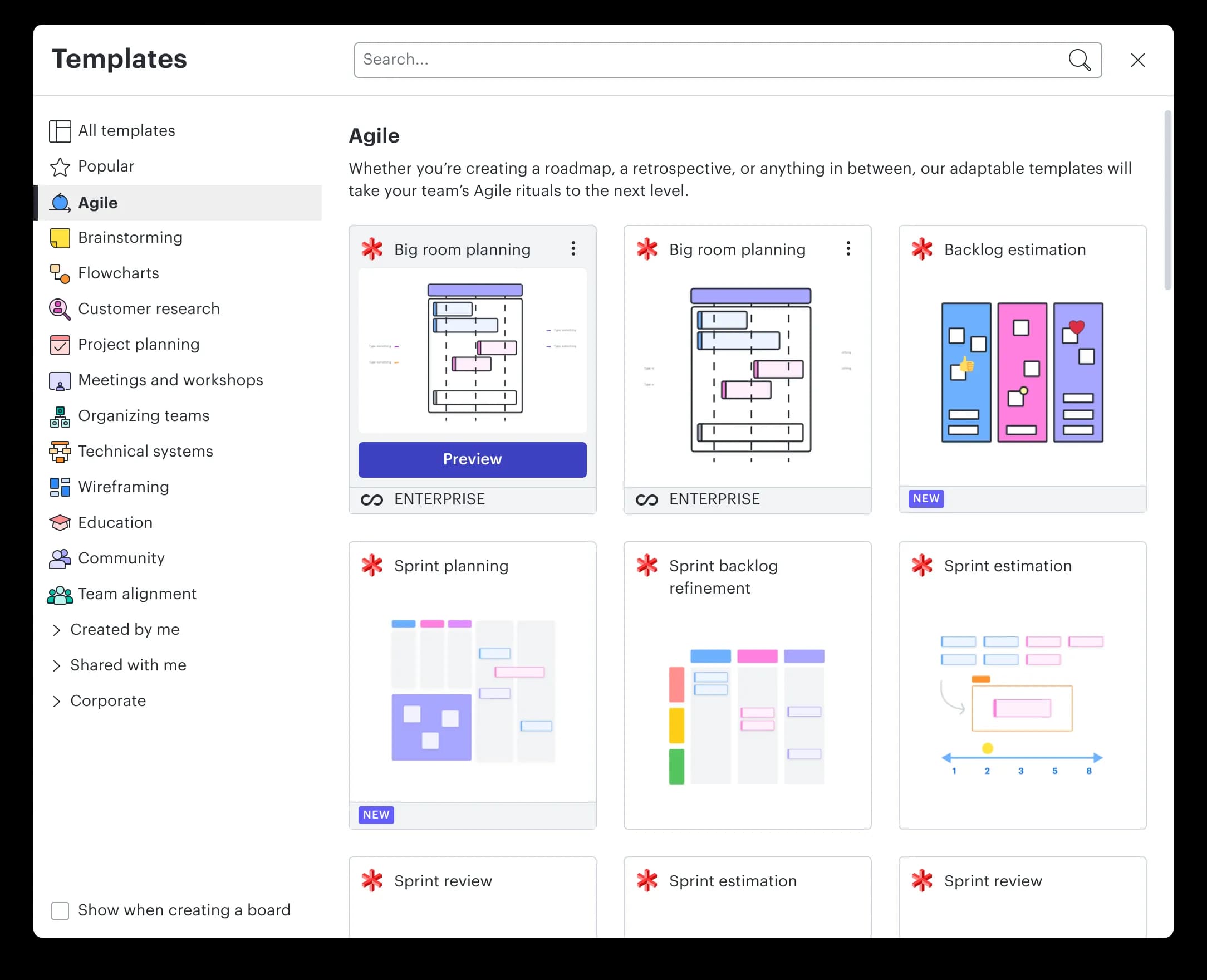
Small work, big reach: these are some of the first things people see when they start something new in Lucid.