[EDITORIAL DESIGN]
One Page, One Job
One-pagers for Lucid that explain a product, an add-on or an integration on a single sheet.
- At Lucid, Ryker designed a series of one-pagers that explain offerings, integrations and features on a single sheet.
- Examples include the Premium support add-on, the Lucid + Google integrations and an overview of the Lucid Visual Collaboration Suite.
- The layouts rely on hierarchy, with a headline that makes the case on its own and scannable bullets, subheads and tables below it.
Summarized by AI from this page. The long version is below.
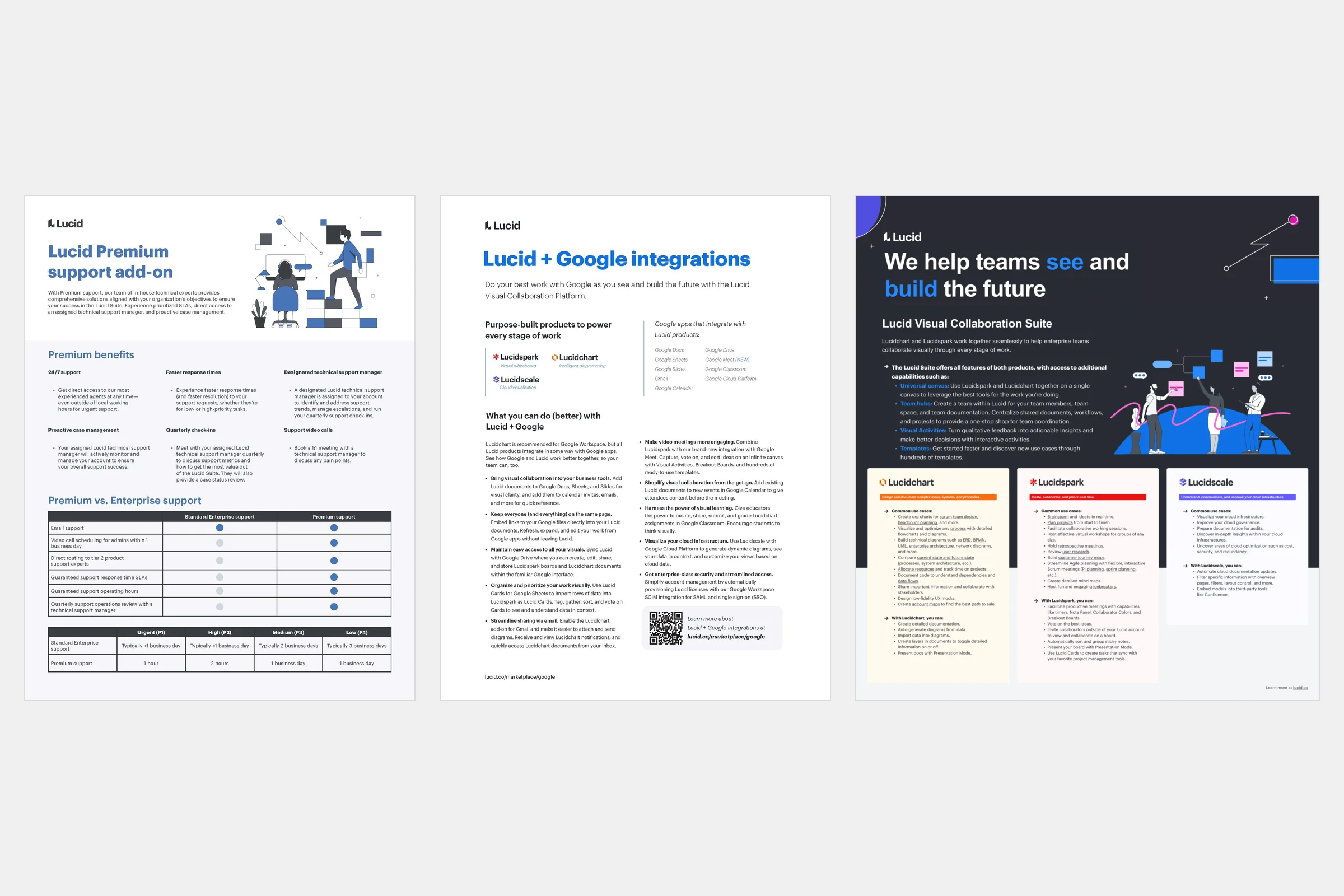
Tech companies constantly need to explain a lot in a little space: what a product does, how security works, what’s new. A one-pager or infographic is usually the answer. At Lucid, I designed a series of them.
The approach
The trick with a one-pager is hierarchy. Most people will read the headline and maybe one section. So the headline has to make the case on its own, and everything below it needs to be easy to scan, with short bullets, clear subheads and a table where a table does the job better than a paragraph.
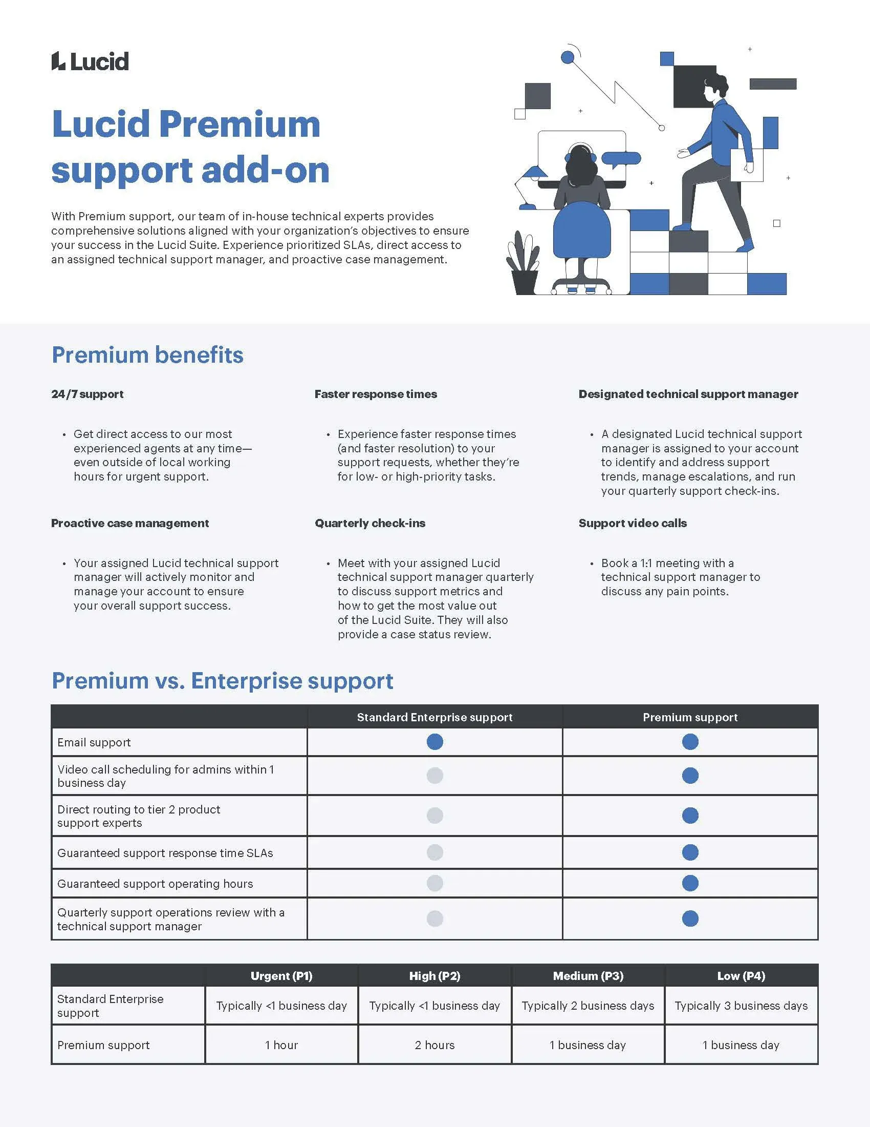
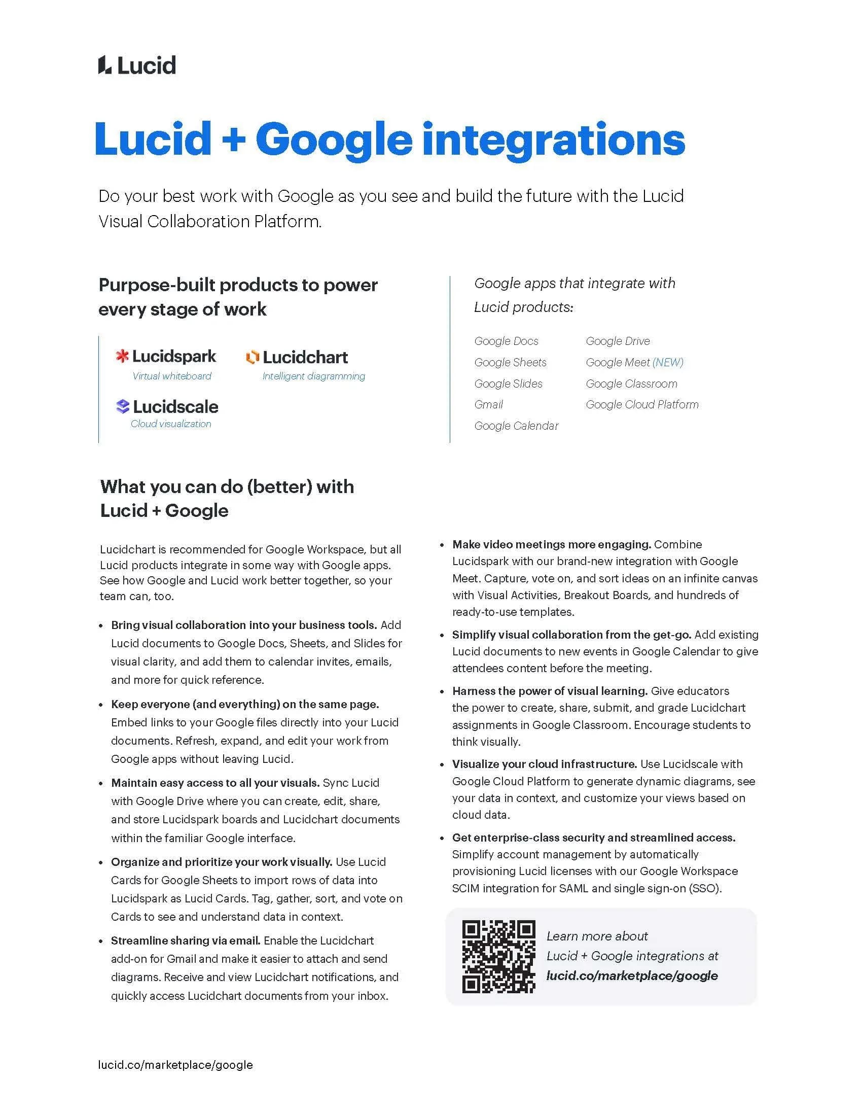
The Premium support sheet leans on a comparison table, because “what do I get for paying more” is a table-shaped question. The Google integrations sheet does the opposite: a short list of products up top, then plain-language bullets on what you can actually do with them, and a QR code for anyone who wants more.
Going dark
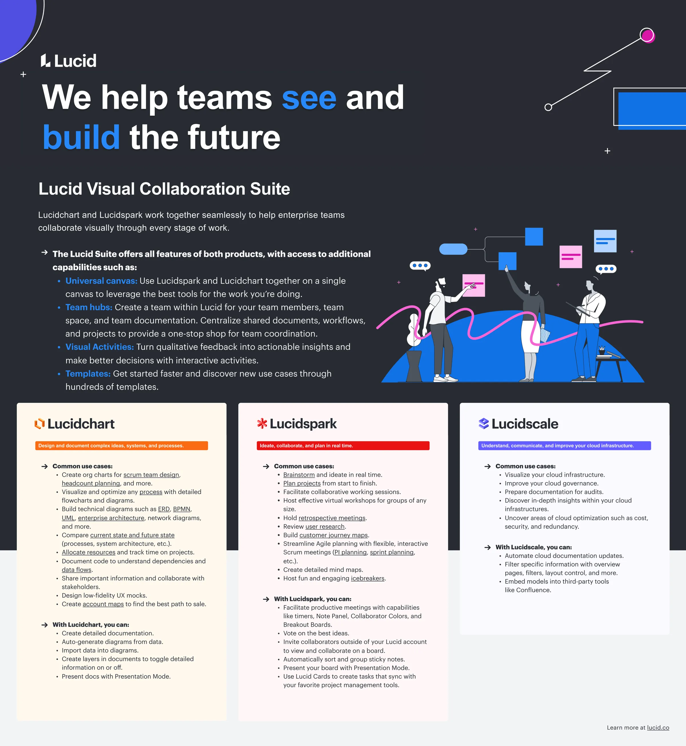
The suite overview flips to a dark background to stand out in a stack of light handouts. One headline, one paragraph, then three color-coded columns, one per product, so you can find yours in a second.
It’s not the flashiest work I do, but it might be the most useful.