[DESIGN PROCESS]
TRON DAO Design Challenge: Process in Review
TRON IMPACT, an imaginary sub-brand and campaign that connects blockchain technology to everyday life.
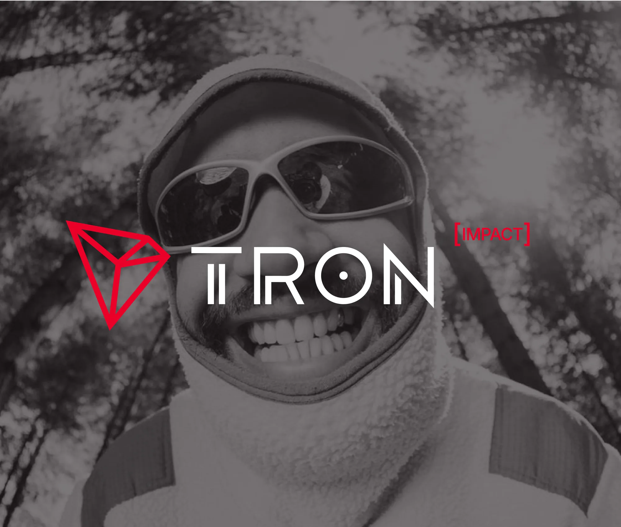
“Create an imaginary campaign on a subbrand called TRON IMPACT that brings awareness to the communities, businesses, and people that TRON directly helps through everyday stablecoin transactions and payments. Think about how photography, imagery, and graphics are used and the overall photo/art direction while conveying this message.”
That was the whole prompt. The challenge wasn’t just making nice visuals. It was building a bridge between blockchain technology and the people whose lives it actually improves. I needed a sub-brand that spoke to a specific audience, still felt like TRON, and could carry a campaign across print, mobile and the street.
Start with the audience
External research pointed to TRON’s most relevant segment for this project: mobile-first (~68%) millennial men (~60%), typically aged 20–30 and middle income. Many are gig workers or people who send stablecoins like USDT across borders, for payments, remittances or remote work.
So every asset was built for a young, on-the-go audience. Whether someone met the brand on a commute, in an app or while scrolling, it had to feel like it belonged in their day.
Find the message
To build trust, I boiled the benefits of stablecoins down to three attributes: fast, affordable and reliable. That became the tagline “Stability for Every Wallet,” with a supporting line: “Lower fees. Faster transfers. Accessible. Anytime. Anywhere.”
Those two lines anchored every piece of the campaign, so even a quick glance would land the value.
Build the sub-brand
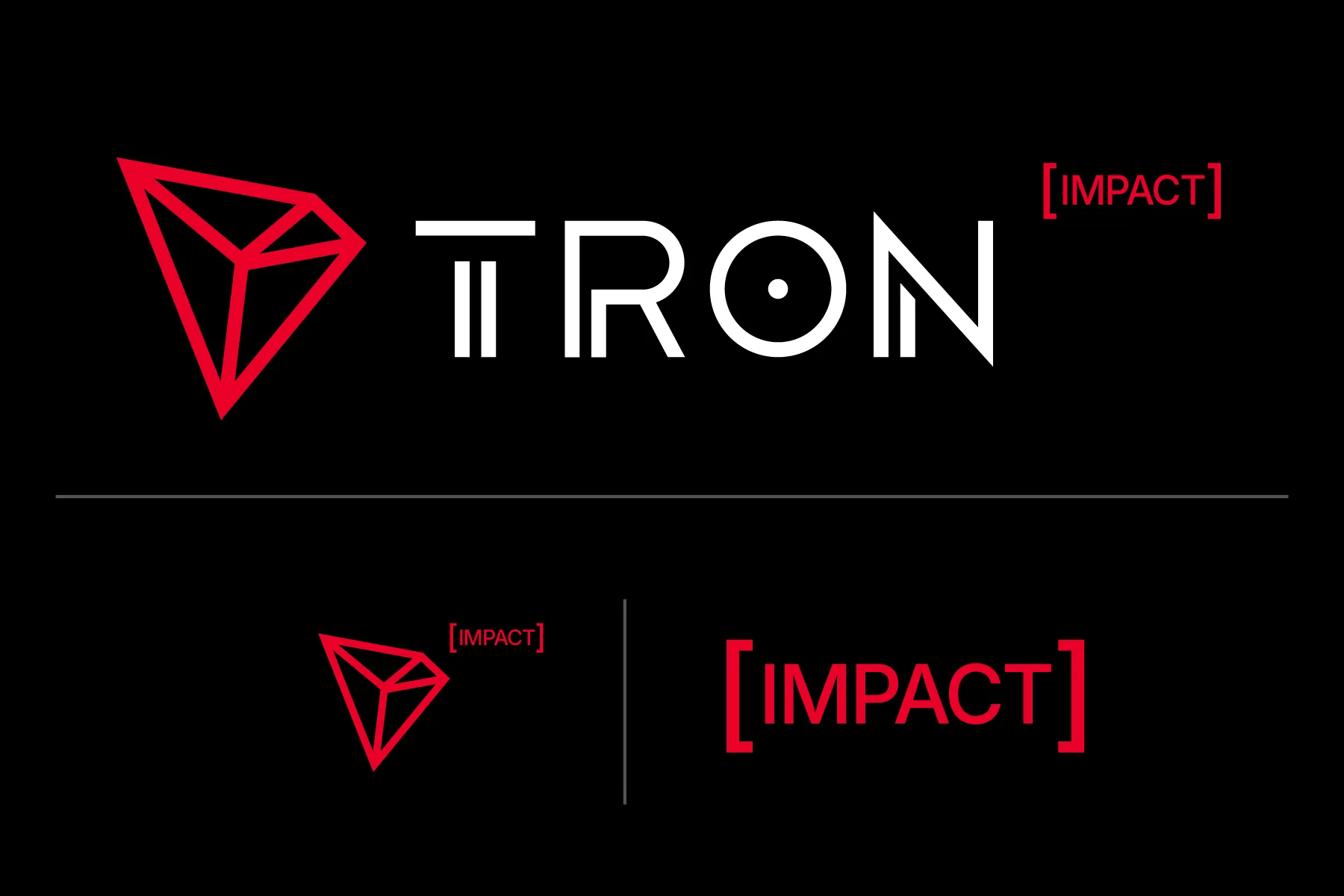
TRON IMPACT had to celebrate individual success and still strengthen the parent brand. I designed a wordmark that attaches to TRON like an exponent, a small nod to growth, so it can sit on existing TRON assets or stand on its own.
I narrowed the palette to red, black and white so it’s easy to use and instantly recognizable. Where legibility is tight, the brand switches to a logo pairing or a standalone mark.
Set the visual direction
With the logo, color and type in place, I turned to the campaign’s look. The imagery had to be human and tangible, but tech-forward enough to feel like TRON.
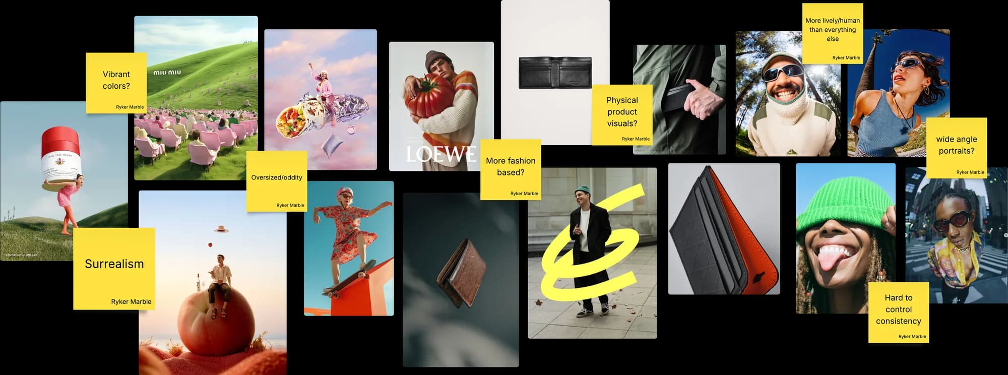
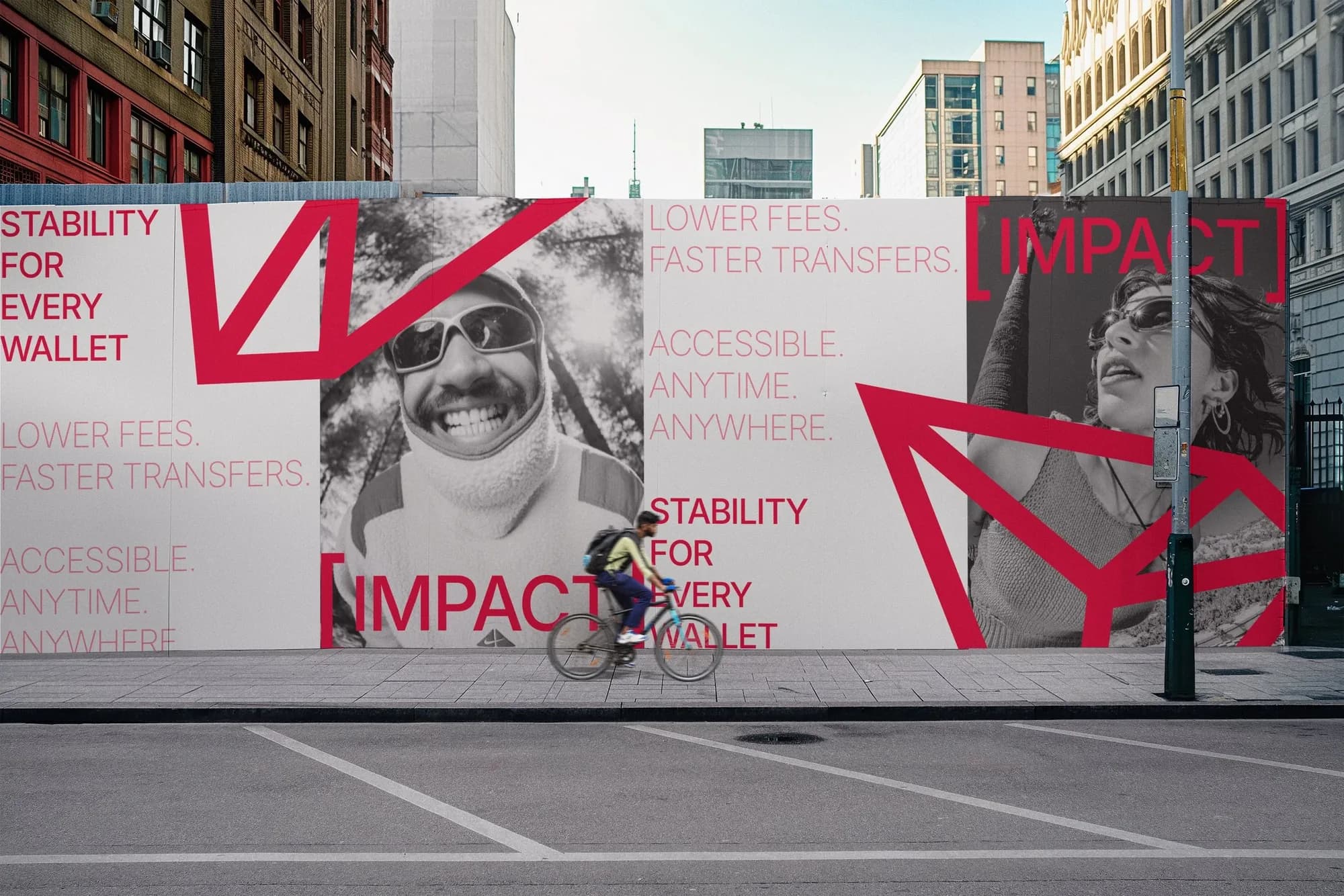
I started with surreal photography for its color and emotional pull, but it was too abstract for the people I was trying to reach. Wide-angle portraits fit better: dynamic, authentic and age-appropriate, with range in place, expression and energy. I paired them with shots of physical wallets to tie the human moments back to what TRON IMPACT is actually about: everyday payments.
Bring it together
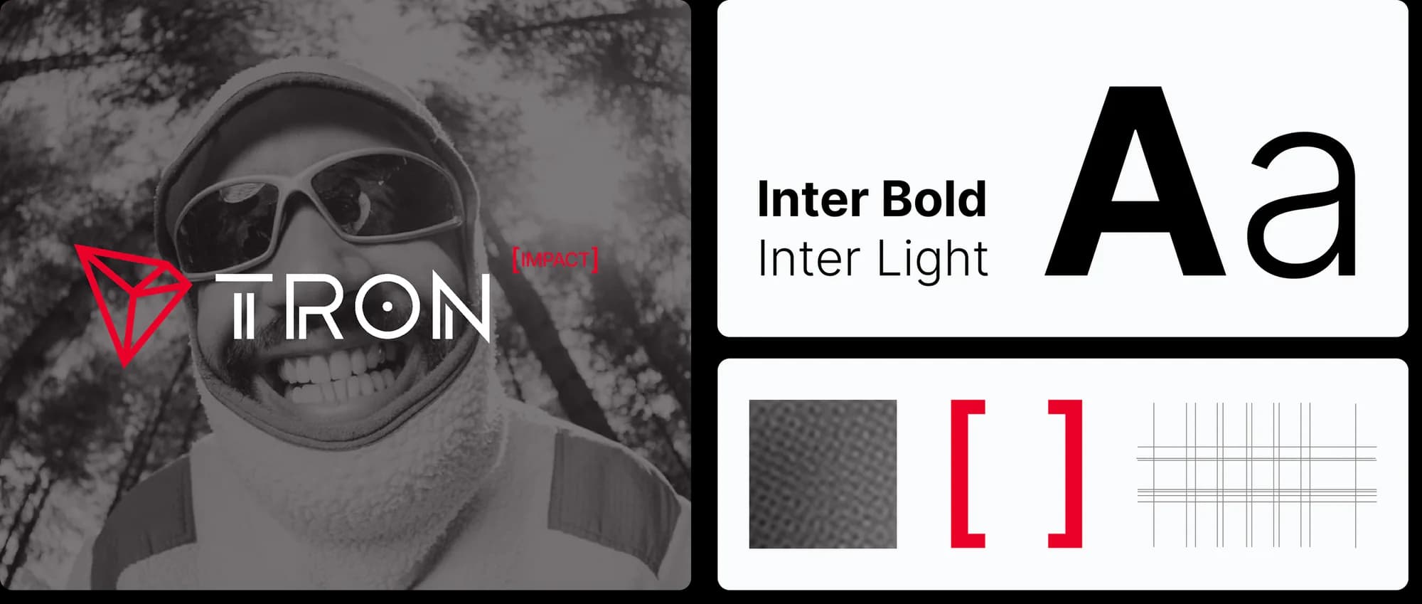
The wide-angle shots were striking, but next to each other they didn’t always feel like one family. The palette fixed that. Desaturating the photos pulled them into the brand’s tone and let the red accents do the talking.
I added a few supporting elements: halftones, a grid built from the TRON logo’s geometry, and the brackets from the IMPACT mark. Together they make a clean, high-energy system that stretches across a lot of formats.
Design the report
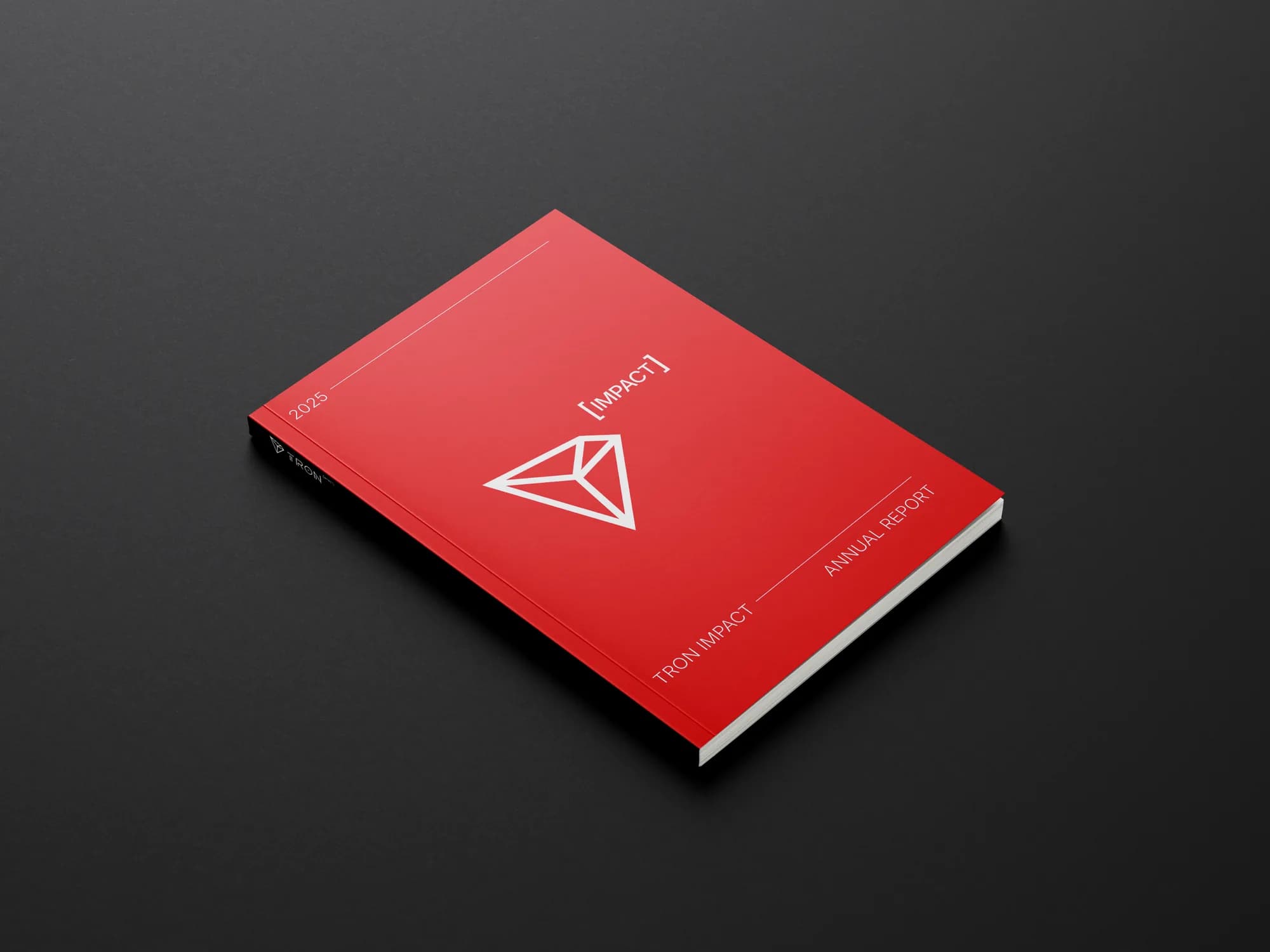
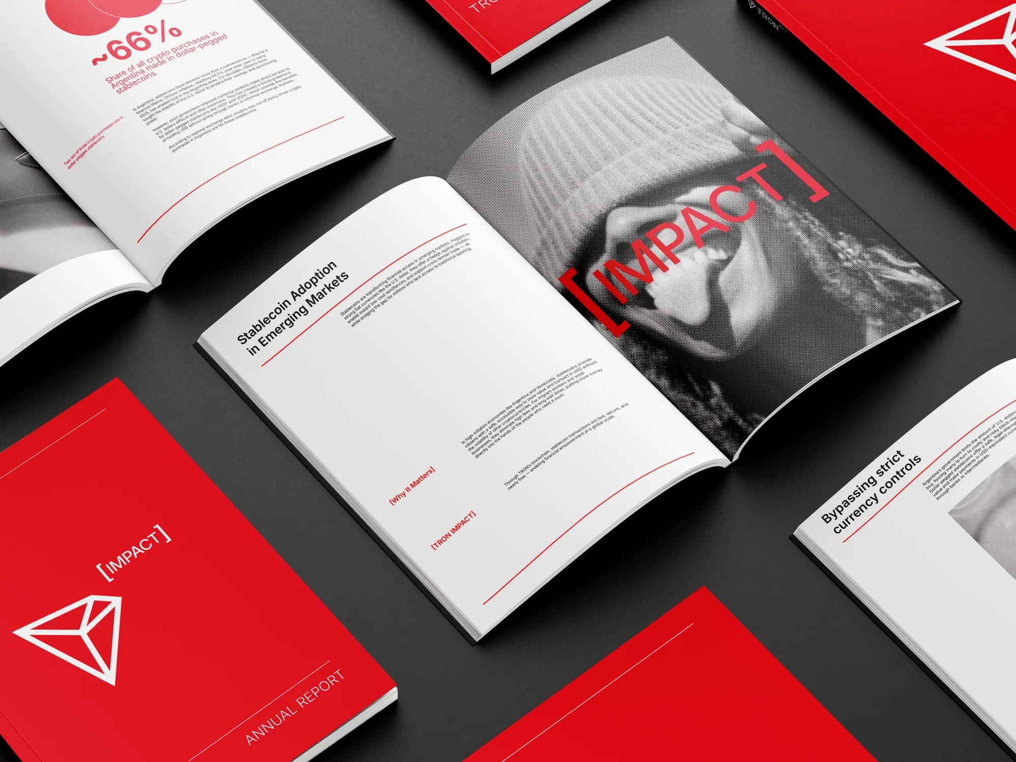
The first piece was a long-form annual report that could work at trade shows, as gated web content or as a leave-behind for investors.
I built it on a four-column grid, with the campaign photography and clean data visualization carrying the key numbers. The cover uses the secondary mark, and plenty of white space keeps it open and easy to read.
Meet them on mobile
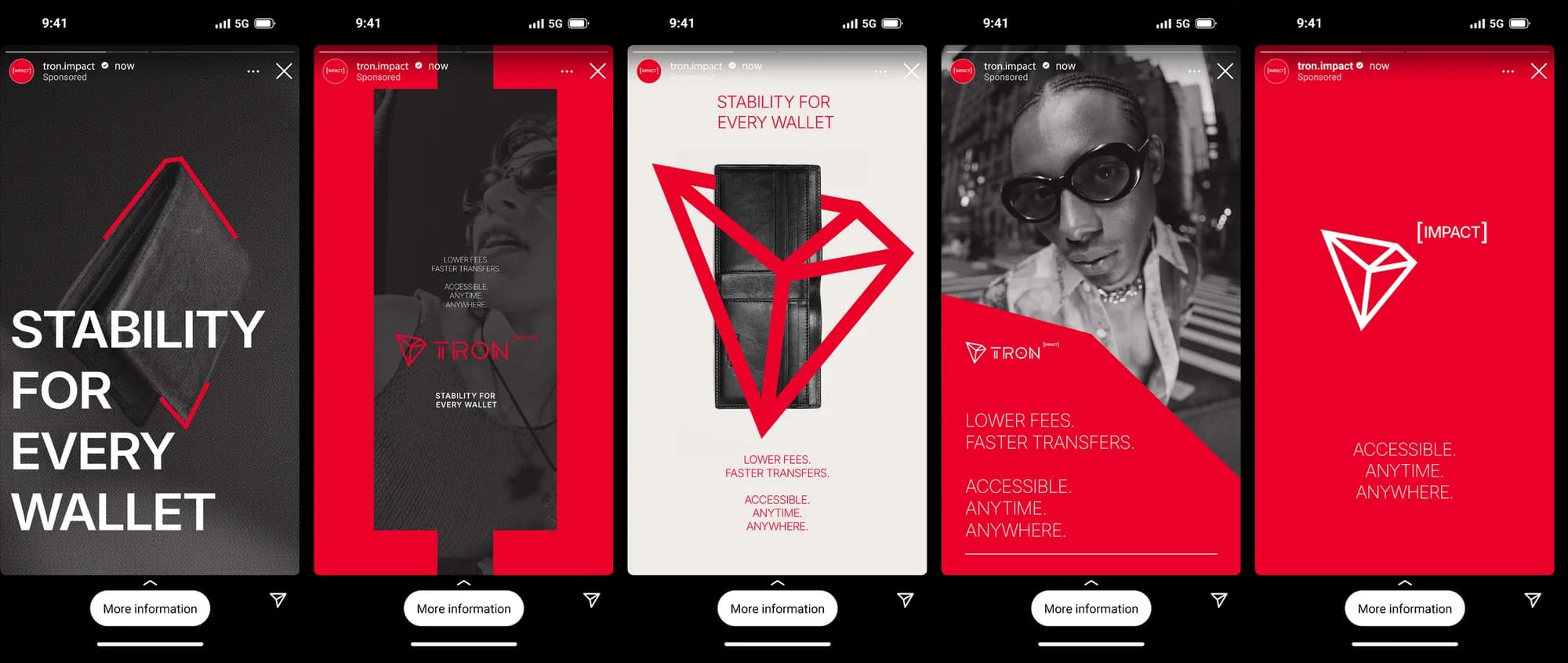
Most TRON users are on their phones, so the campaign had to show up where they already spend time: social feeds and messaging apps like WhatsApp.
The mobile ads are simple and direct, built on the same imagery, type and graphic elements as everything else, so they stay recognizable mid-scroll.
Take it to the street
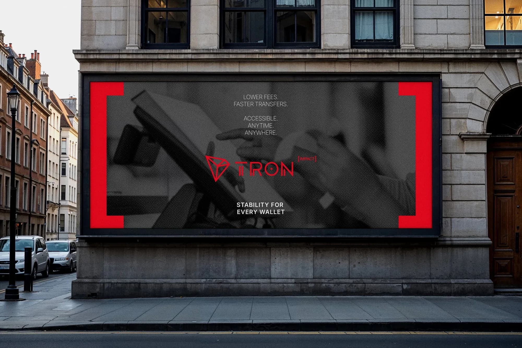
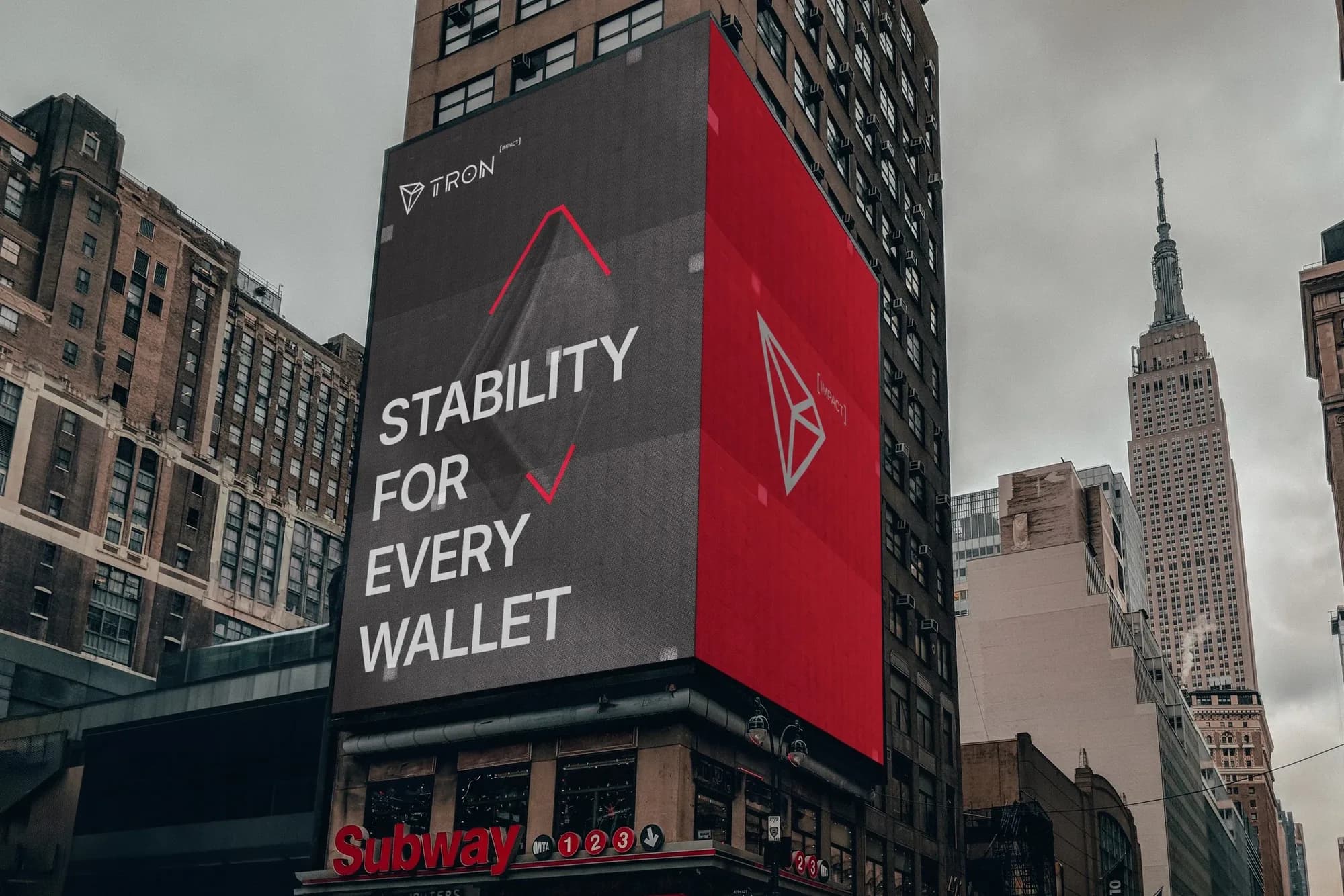
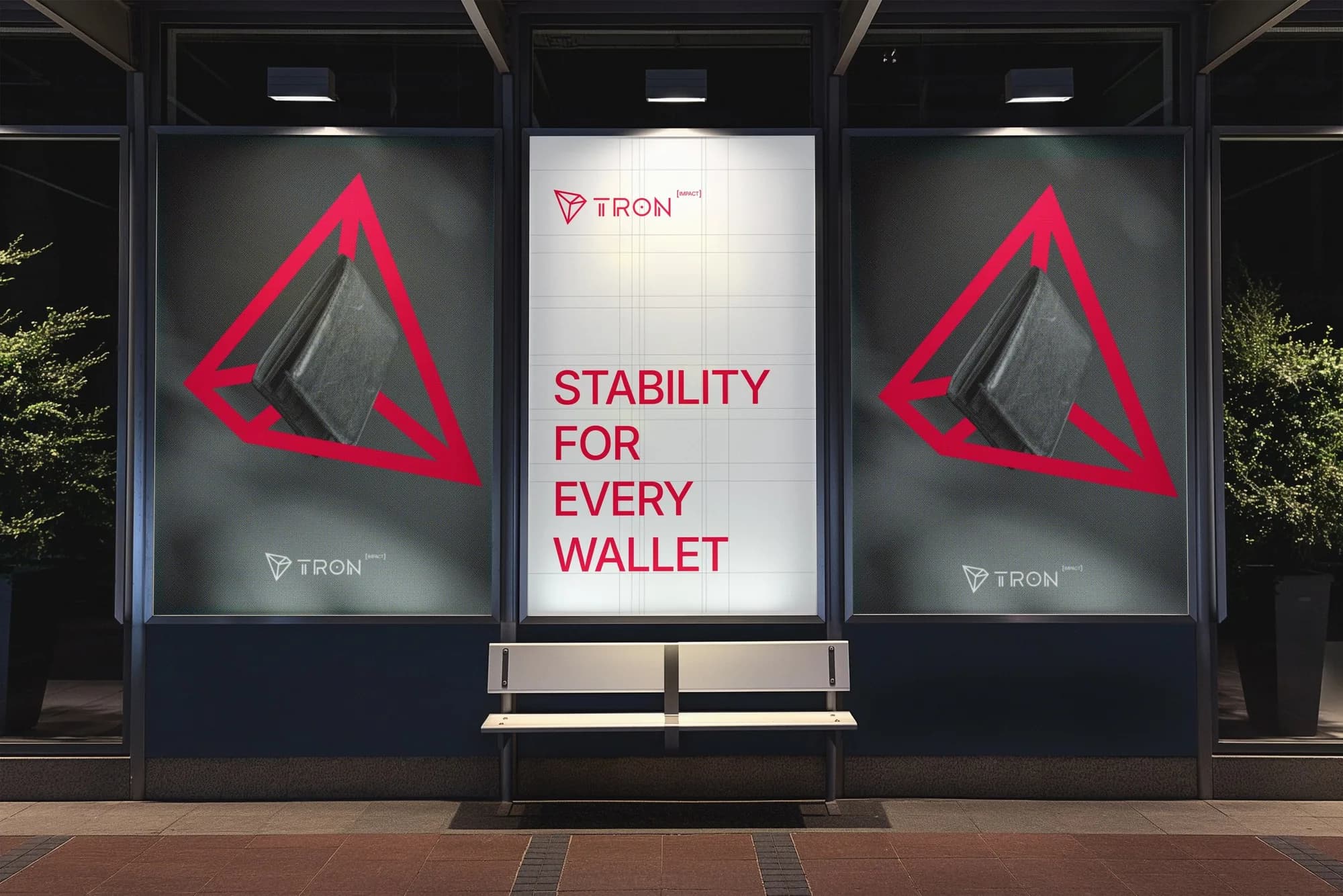
The last touchpoint was billboards in areas with heavy gig-worker traffic. They sit at the top of the funnel, building familiarity with TRON IMPACT before anyone meets it on a screen.
What I took from it
The assets were the easy part to see. The real work was the order of decisions: audience first, then message, then a system, then the campaign. Starting from who the work is for kept every choice, from the portraits to the palette, pointed at the same goal: making blockchain feel like something that helps real people with real money.