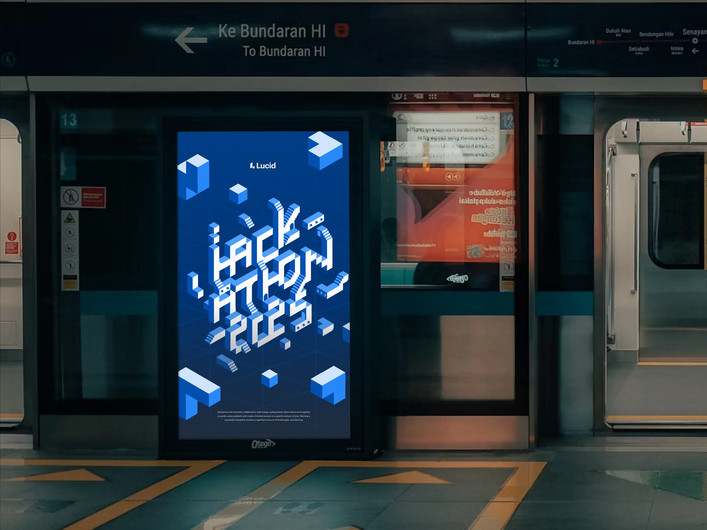
Lucid Hackathon 2025: designing the impossible
An event identity built on one idea: complex problems get solved by changing perspective.
- Ryker was lead brand designer for Lucid Software's 2025 hackathon and owned the identity end to end.
- The idea: complex problems get solved by changing perspective, drawn from M.C. Escher and Monument Valley.
- He built an isometric grid and a modular library of 3D-like forms from one isometric square, then explored two directions.
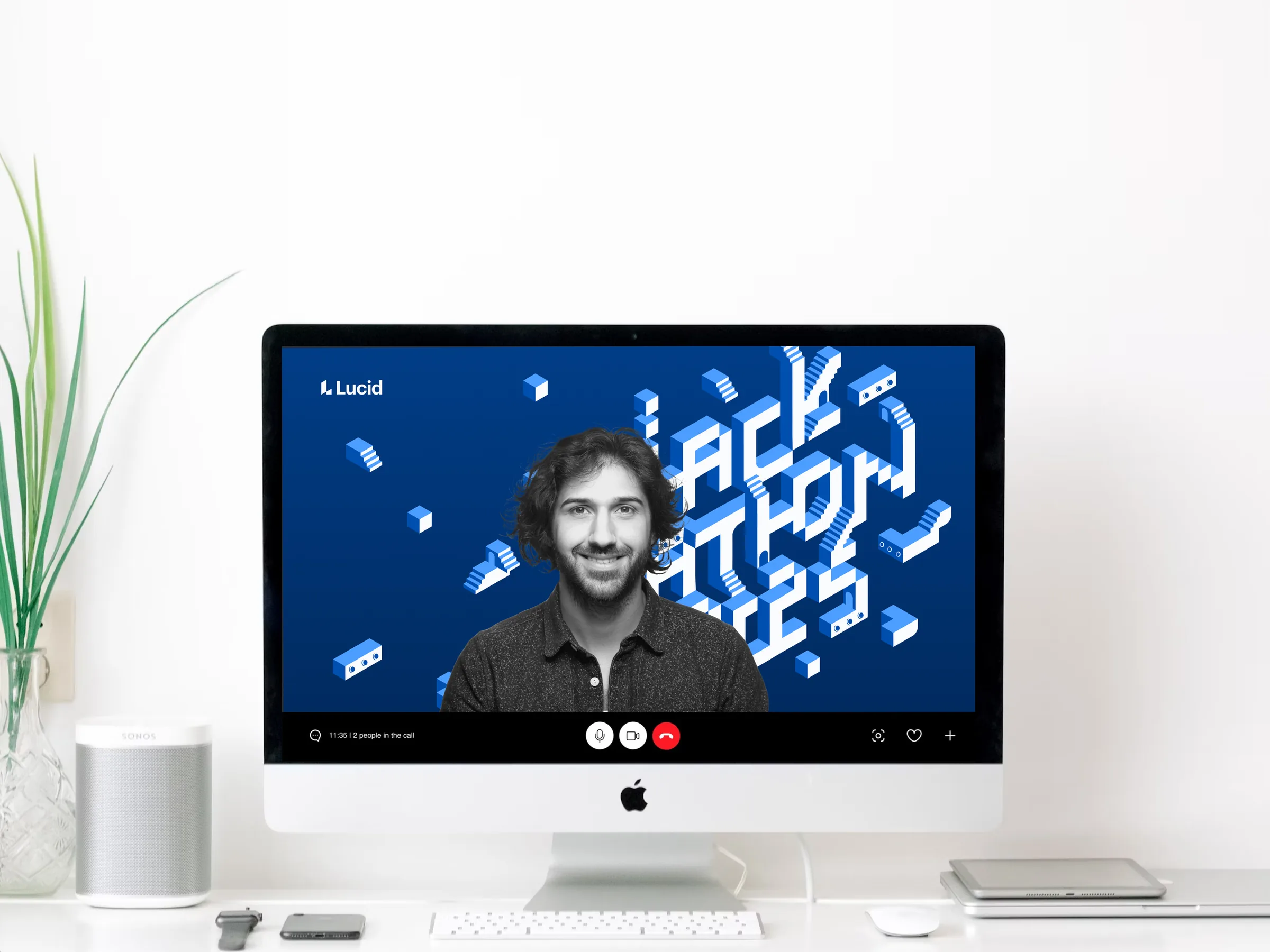
- He presented two directions; the team chose a typographic sculpture with arches and staircases linking the letters, which carried through the logo, slides, signage, badges, swag and a digital toolkit.
Summarized by AI from this page. The long version is below.
- [ROLE]
- Lead Brand Designer
- [CLIENT]
- Lucid Software
- [YEAR]
- 2025
[The brief]
Lucid's annual hackathon is a cornerstone event for creativity and cross-functional teamwork. A good one takes more than a clever prompt and some snacks. It takes an identity that makes the whole event feel like one experience. As lead brand designer, I owned that identity from the first reference board to the last sticker.
[The idea]
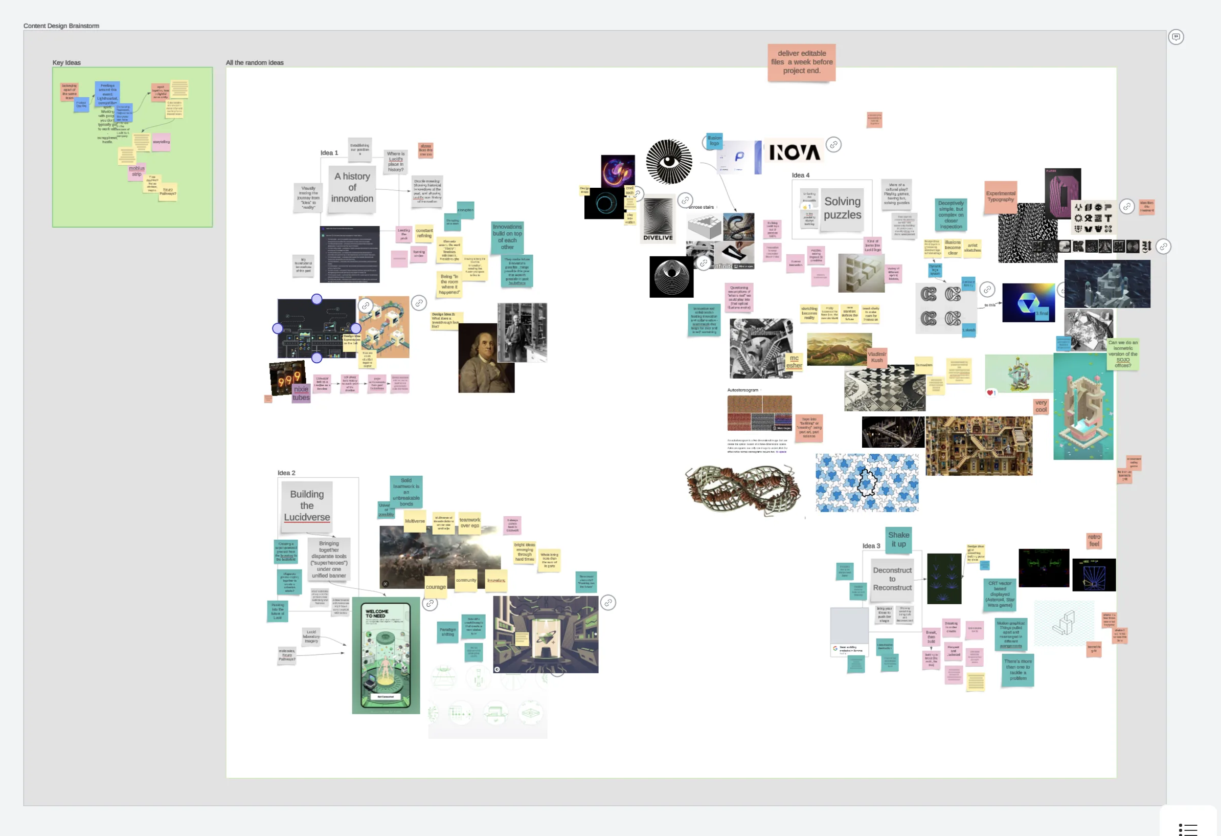
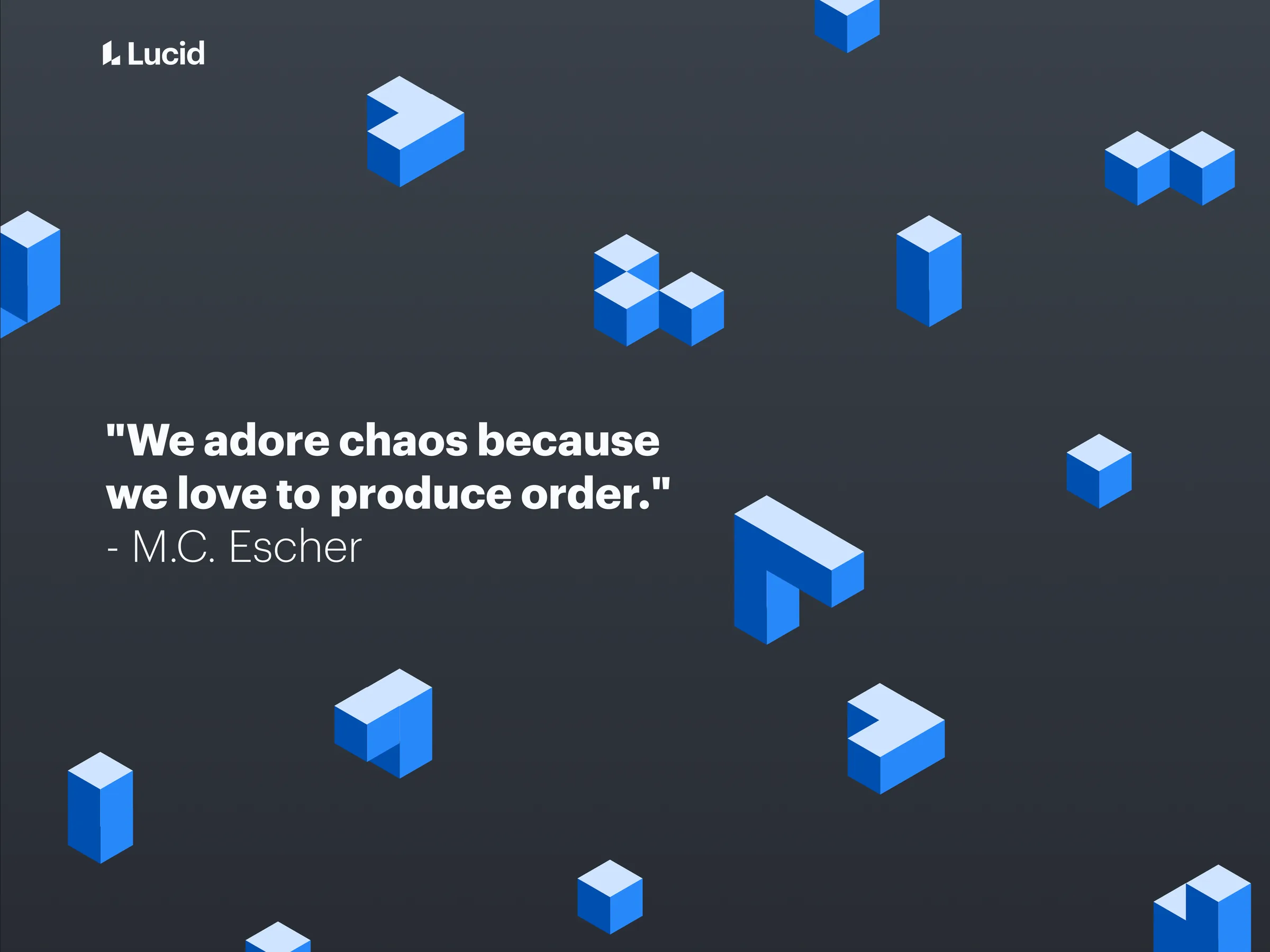
The event team brought a strong set of references, including M.C. Escher's impossible architecture and the game Monument Valley. We pulled them onto a Lucidspark board and annotated what stood out: impossible staircases, floating pathways and playful illusion. They all pointed to one message. Complex problems have more than one solution, and the ones that look impossible usually just need a change of perspective.
[A modular system]
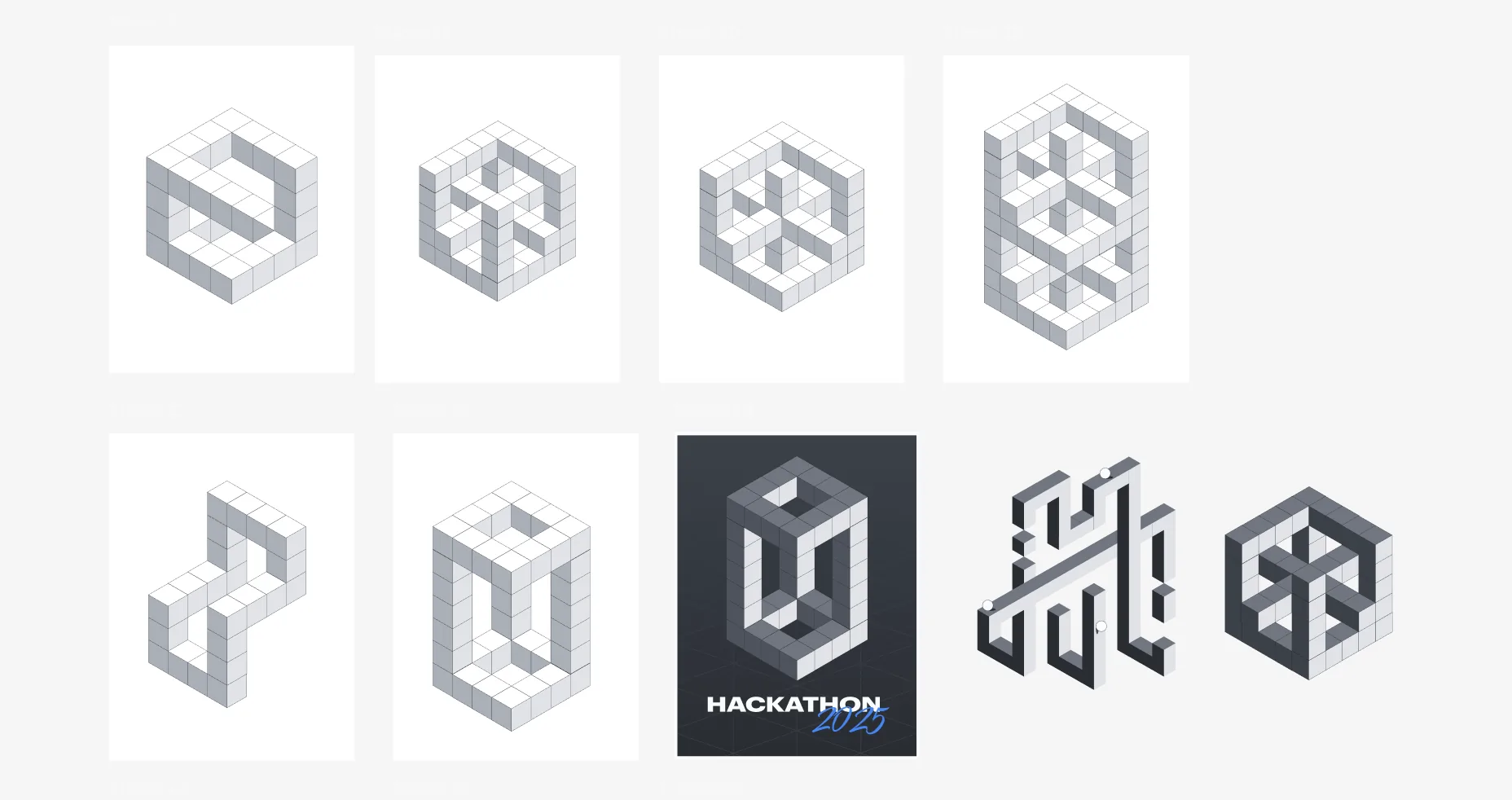
I started with an isometric grid as the foundation for everything else. Skewed perspective is hard to control, especially for symbols that need to feel dynamic and stay readable, so I reduced the toolkit to one building block: an isometric square. From it I built a library of modular, 3D-like forms that I could duplicate and remix, which kept every later piece consistent.
[Two directions]
The first direction paired a striking, surreal impossible shape with clean modern type. The second used the isometric blocks to build the event title itself as a typographic sculpture. I presented both to the program team, and we worked through what was landing and how to push it further.
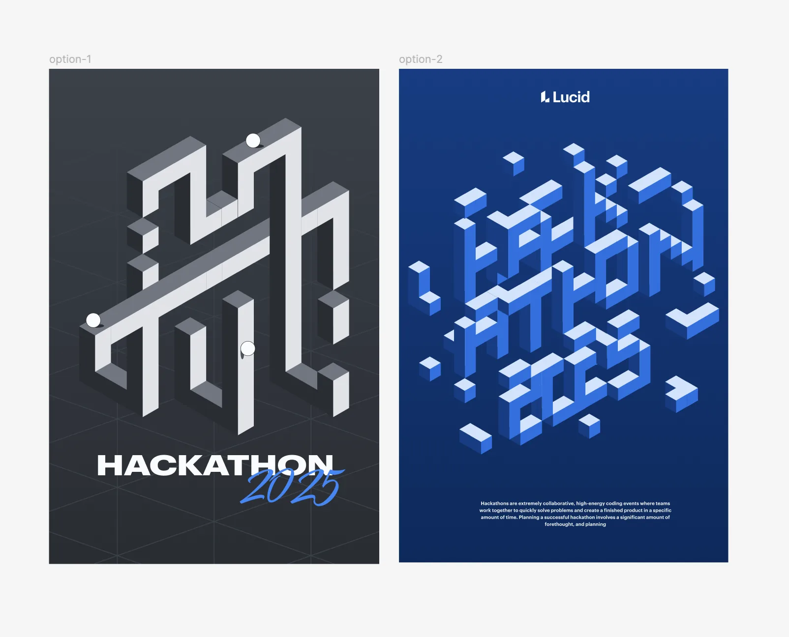
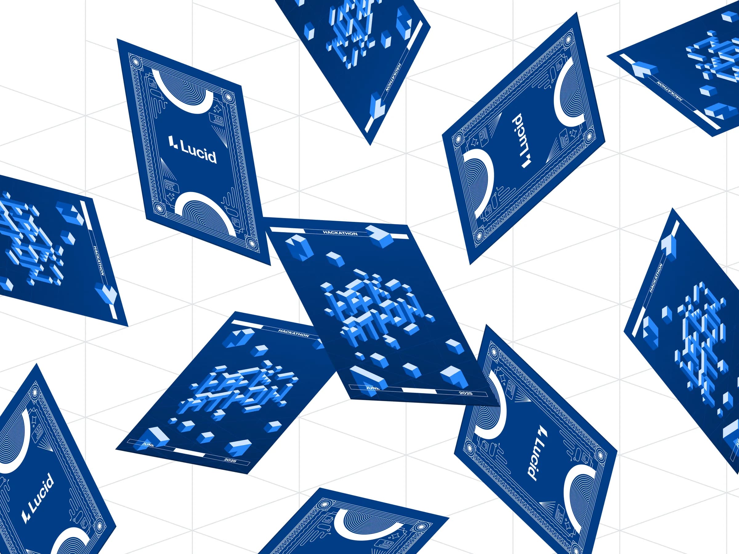
The team chose the typographic route. It was the harder one to keep legible and scalable, but it told the story better. Arches and staircases connect the letterforms, so reading the title feels like navigating a complex idea with both creativity and structure.
[The rollout]
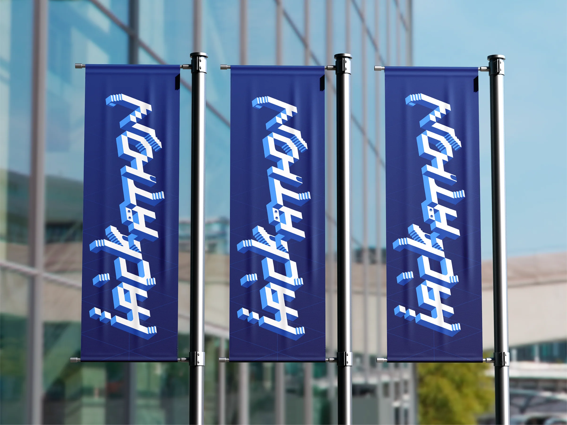
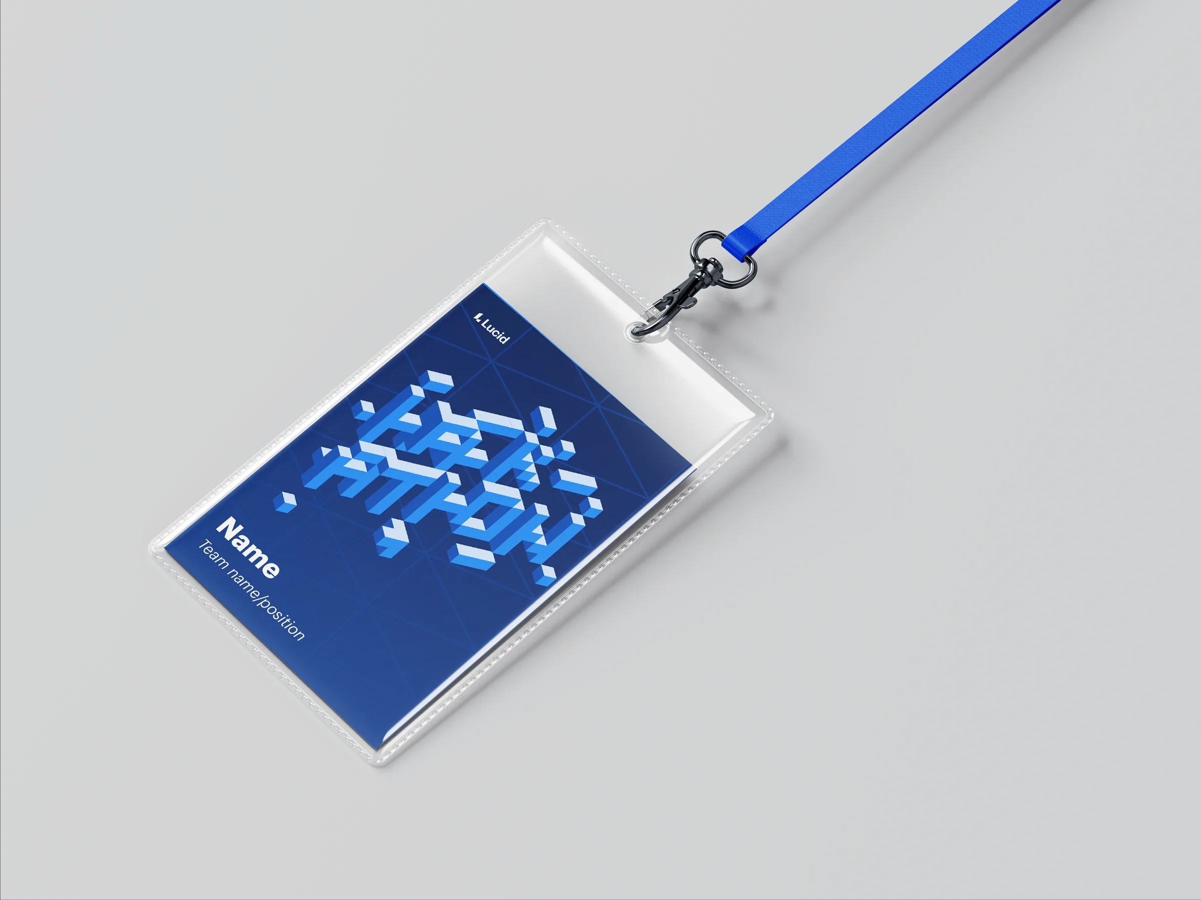
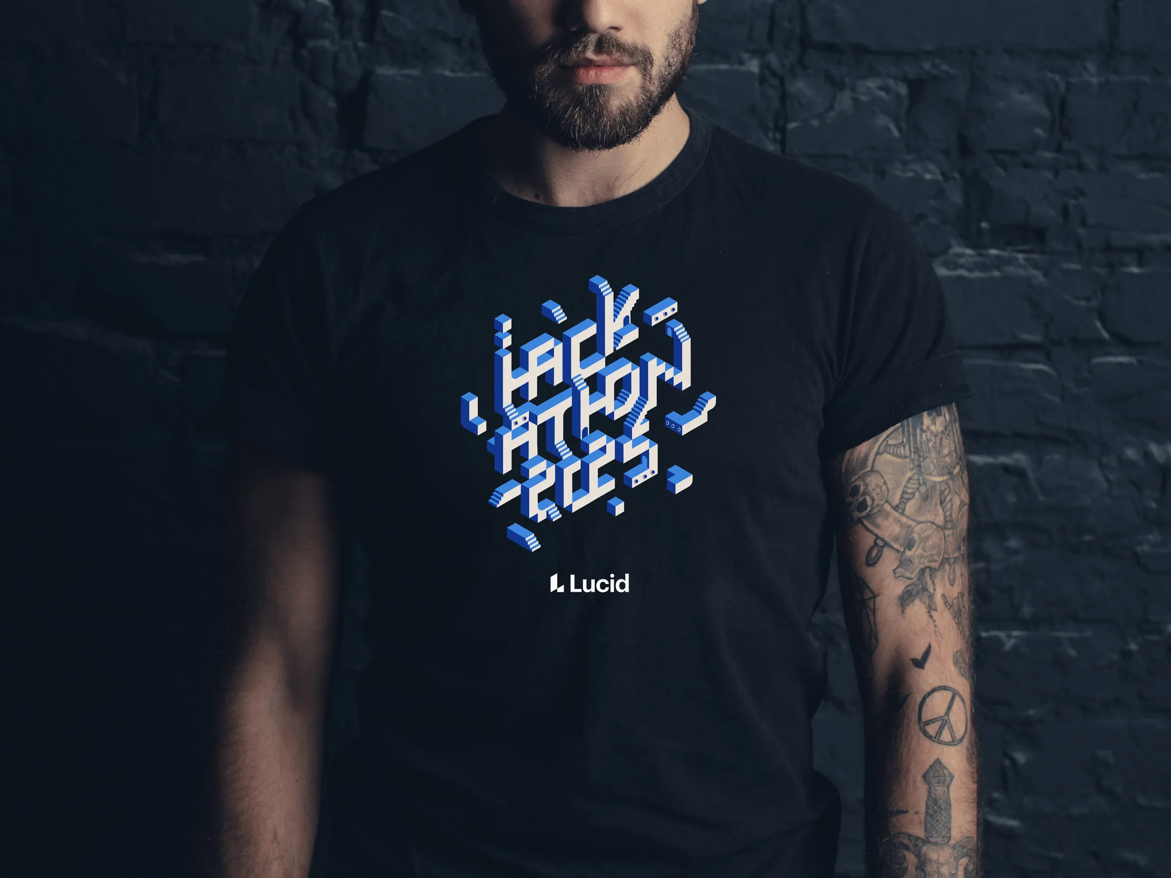
Because every piece came from the same isometric system, the identity scaled from a logo to a full event without losing its shape.
- A custom logo mark inspired by M.C. Escher
- Slide templates, signage, badges and swag
- A digital toolkit for internal marketing and team presentations
Impossible in all the right ways.