Brand system for an AI agent
heyryker.com: a brand system written for an AI agent
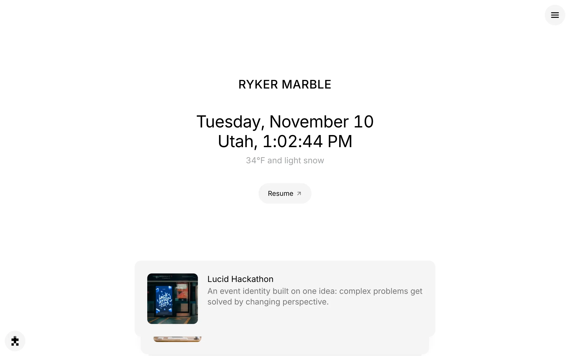
I wrote this site's brand system as a brief an AI agent builds from, then art directed it through three visual directions without designing a single page by hand.
- Ryker built this site by writing its brand system as a brief that an AI coding agent (Claude) reads and builds from: color tokens, type rules, voice rules, layout rules and what never to do.
- He art directed the build through more than 50 reviewed pull requests, each with a live preview, and took the site through three visual directions.
- Changing direction meant changing the rules, not redrawing pages, which is what made it cheap to throw out a version he already liked.
- He taught himself the workflow for this site, and reused it for Conjure, a generator that turns a poem into a picture by rules he designed.
Summarized by AI from this page. The long version is below.
The brief
Nobody asked for this one. My portfolio lived on Squarespace and looked like every other portfolio on Squarespace. I wanted a site that worked the way I design, and I wanted to learn how to build with an AI agent instead of just reading about it.
So I didn't start in a design tool. I started by writing the brand down.
A brand system an agent can read
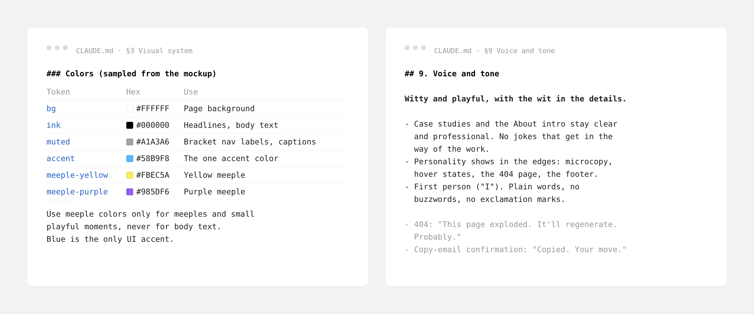
The brief is a single file in the code repository that the agent reads before every change. It reads like brand guidelines, because it is one, written for a reader that follows every rule literally.
- Tokens. Every color has a name, a value and a job. The accent is for one thing, and the brief says which thing.
- Type. Which typeface, which weights, where uppercase goes and where it doesn't.
- Layout. Everything snaps to one grid cell, even after the grid lines themselves were removed.
- Voice. First person, plain words, no exclamation marks, sentence case. Case studies stay professional, and the personality lives in the edges.
- Never. Never invent a metric, a client or a quote. Mark what's missing instead.
Art directing the build
I reviewed every change as a pull request with its own live preview, on my laptop and my phone, before it went live. More than 50 have been merged so far. It felt less like prompting a chatbot and more like art directing a very fast developer who never got tired of "move it one grid cell to the left."
When something was wrong, I fixed the rule, not just the page. A note like "yellow never carries text on white" became a rule once, and every page after that followed it.
Three directions, one system
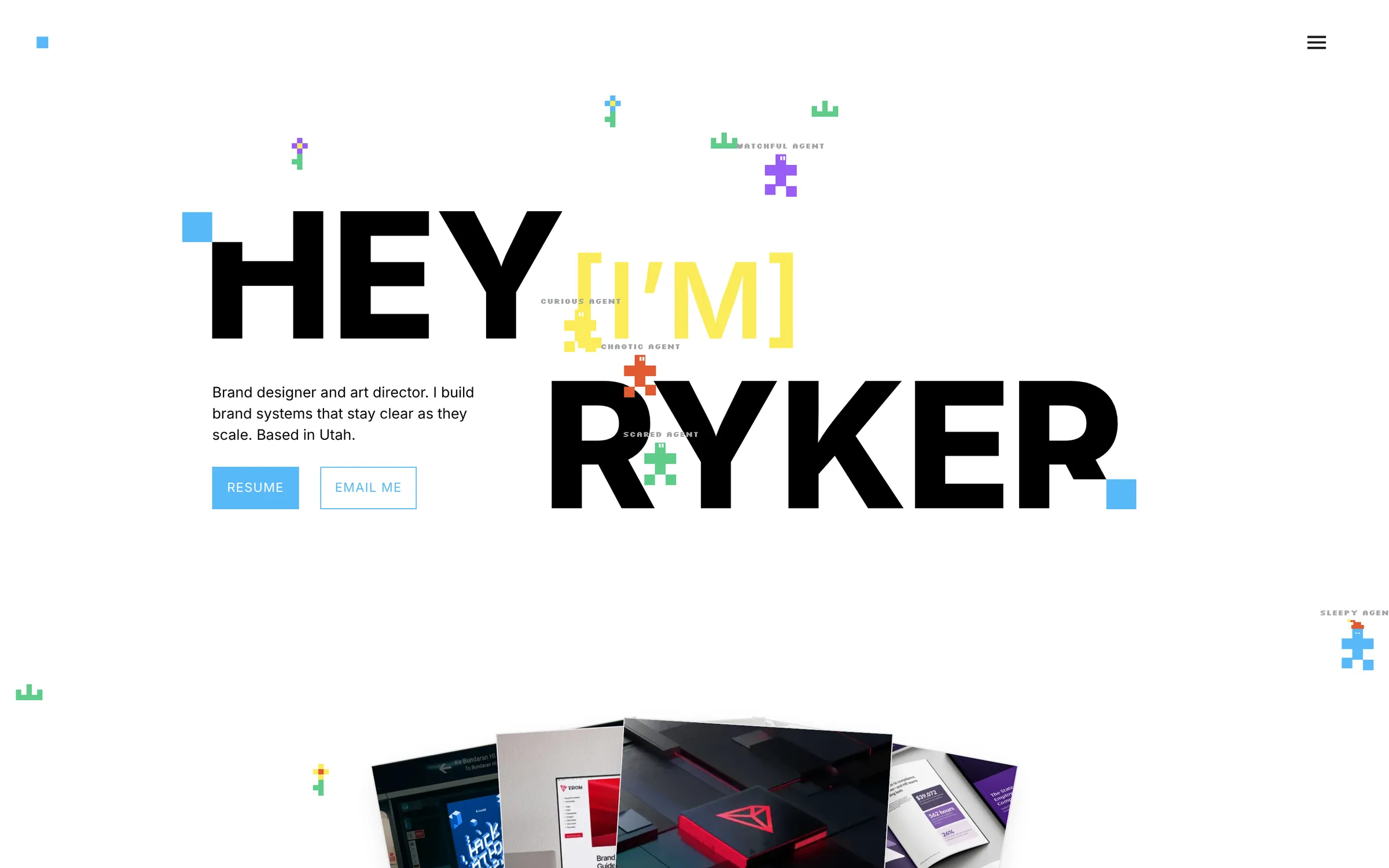
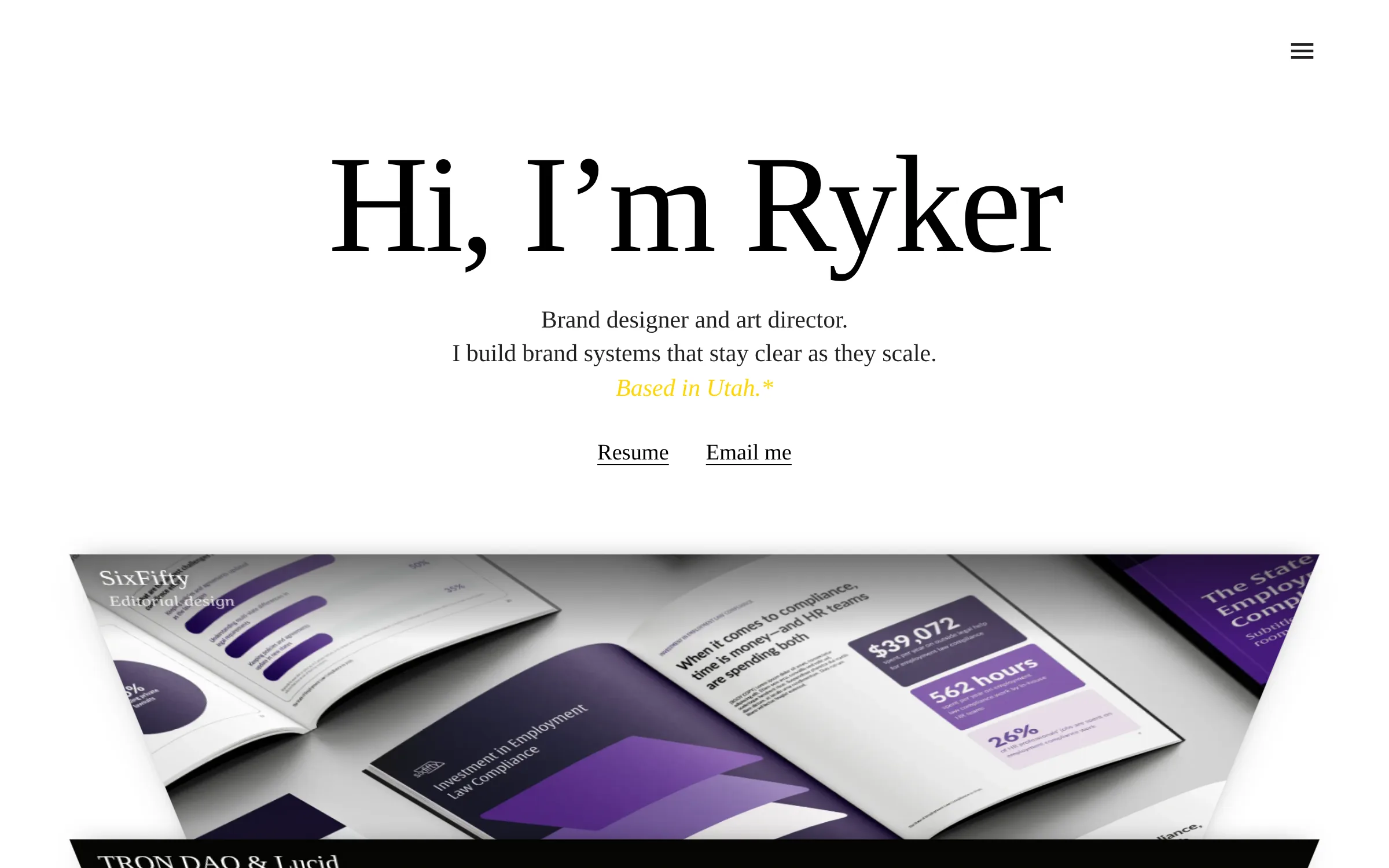
The first version was loud: a big headline, a garden and five pixel characters all asking for attention. Looking at it as a hiring manager would, the work was the quietest thing on the page. So I ran two more rounds, each one taking something away.
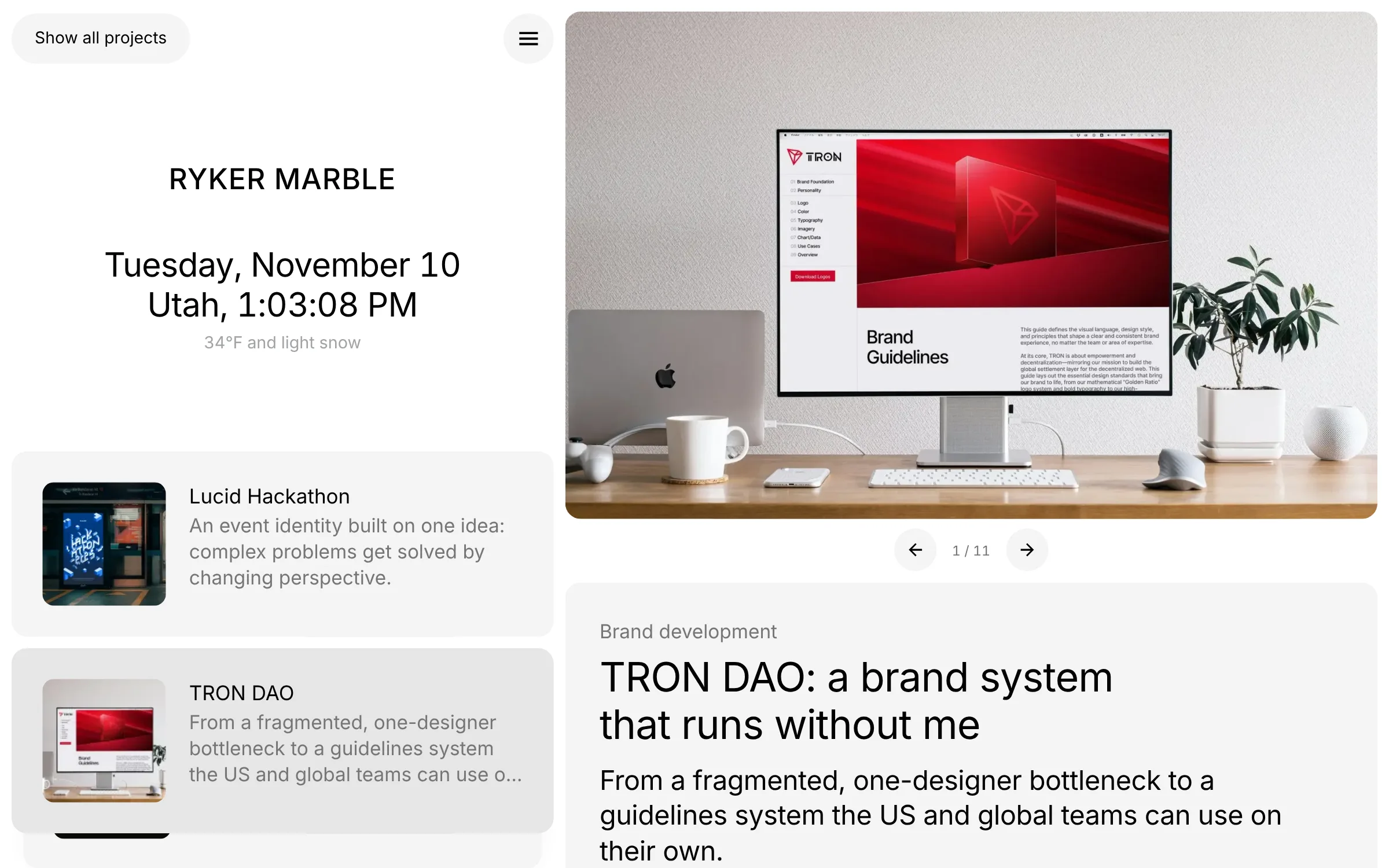
Each change of direction started as new rules: a new accent, a new typeface, a new layout. The pages followed. That's what made it cheap to throw out a version I already liked, and it's why the current site, a clean two-column grid with plain gray cards, took minutes to try instead of weeks.
Building the generator
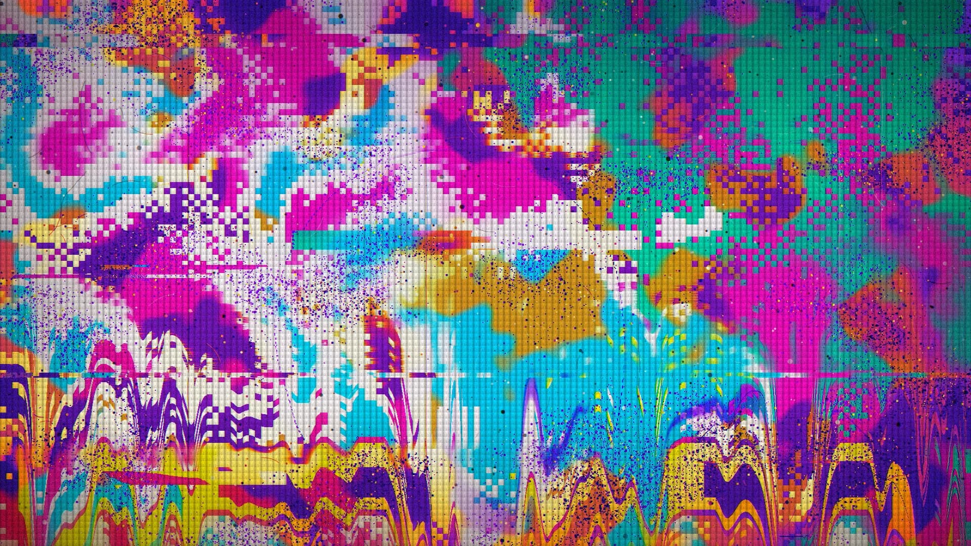
I used the same approach for Conjure, a small site that turns a poem into a one-of-a-kind picture. No AI makes the pictures. I designed the rules: how the poem's rhythm, mood and imagery pick a scene, a palette and a pixel size. The code applies them every time, and no two pictures come out the same.
What changed
AI didn't give me ideas. It took away the cost of trying them. When a direction takes minutes to see instead of a weekend, you try a lot more of them, and it becomes just as cheap to take things away. Writing the rules down first is what made that work.
More on the weekend build, the cost and the meeples in the blog post.