Motion art direction
TRON DAO partner ads
I storyboarded and designed TRON DAO's partner ads with MetaMask and zerohash, then handed the frames to motion and kept them on brand to the final cut.
- Ryker art directed TRON DAO partner ad videos with MetaMask and zerohash, and did all the storyboarding and design himself before handing off to motion.
- He built visual systems that bridge TRON's identity with each partner's, using one shared structure: a dark TRON world, the partner's world, then a red end card.
- He directed pacing, lighting and logo reveals with motion designer Rafael Conce at Sons Design.
- He ran brand-consistency checks through the final handoff.
Summarized by AI from this page. The long version is below.
The brief
As part of TRON DAO's internal creative team, I art directed a series of ad videos about the ecosystem's partnerships with MetaMask and zerohash. Each one had to explain a technical integration in a few seconds of a social feed.
I did all the storyboarding and design. Then I handed the frames to motion designer Rafael Conce at Sons Design and worked with him and the TRON design team to bring them to life. My job was to keep the work clear and on brand from the first frame to the final handoff.
One structure, two partners
Both ads follow the same three beats, so the series reads as one campaign even though the partners look nothing alike.
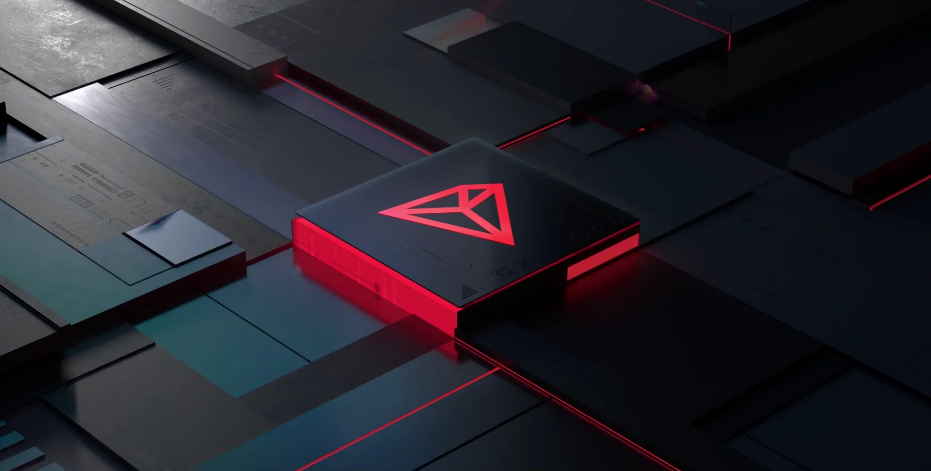
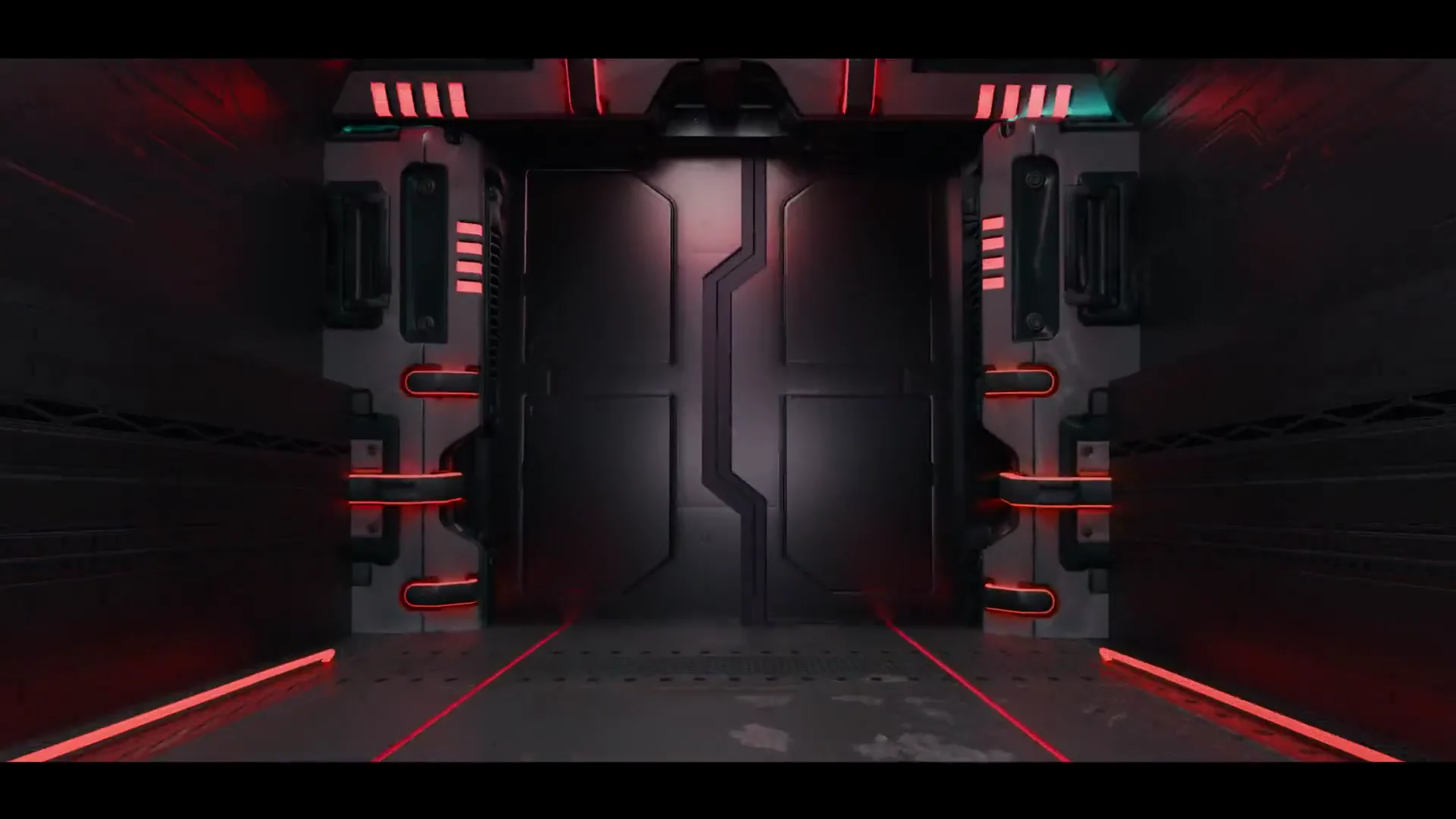
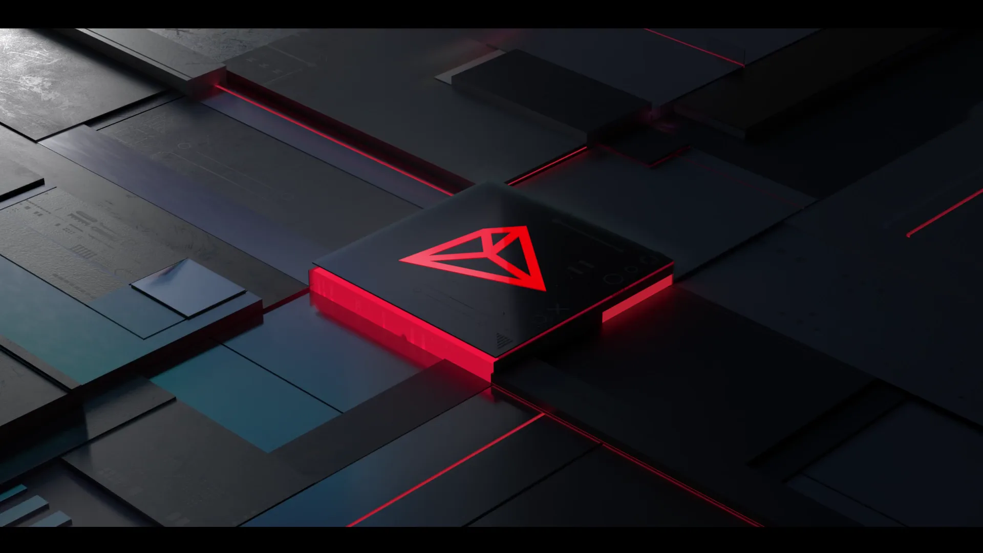
- TRON's world. Dark, tech-driven corridors and tiles, lit in TRON red.
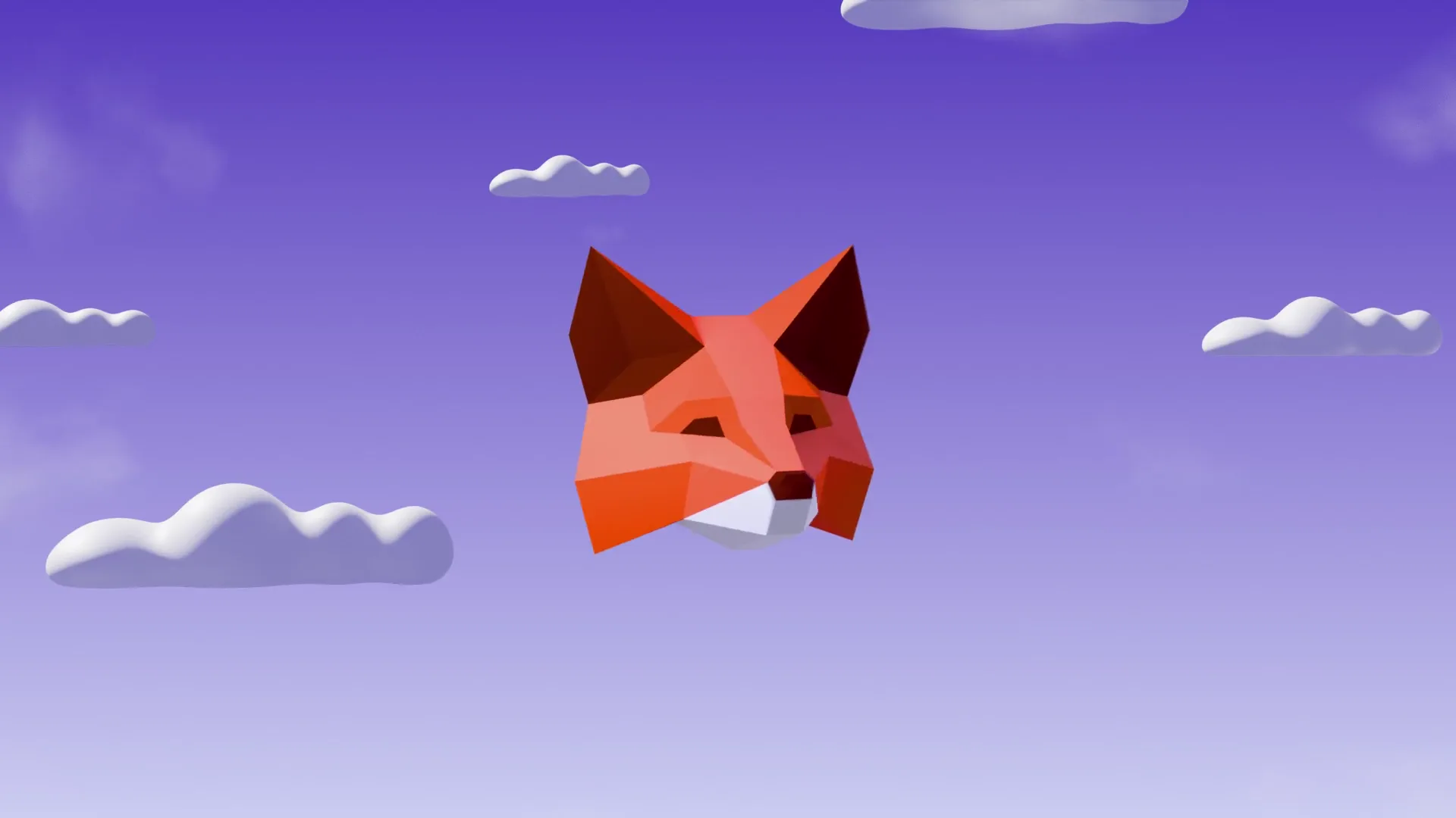
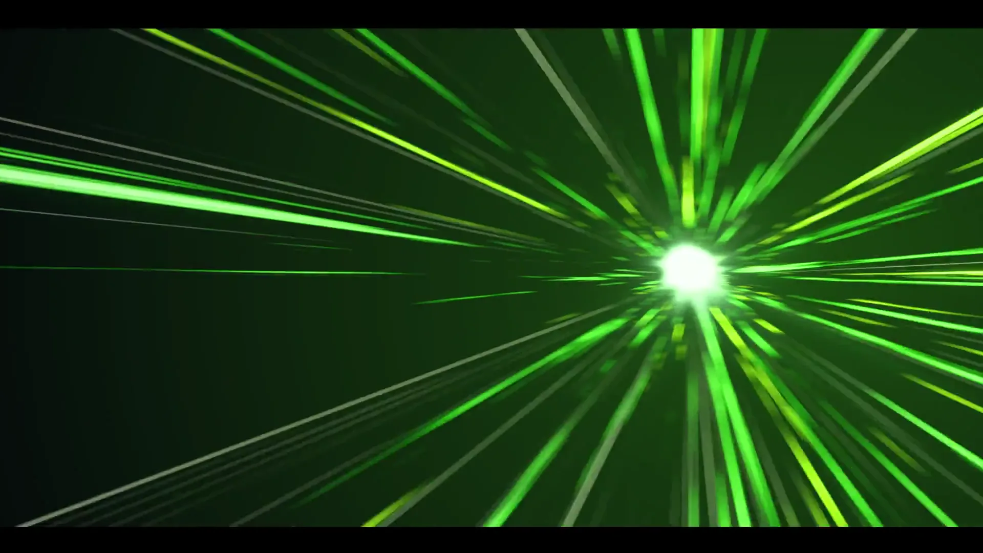
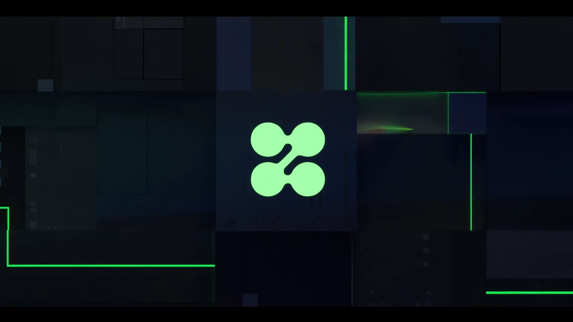
- The partner's world. The story breaks out into the partner's own look: MetaMask's fox in a soft, cartoon sky, zerohash's mark in its acid green.
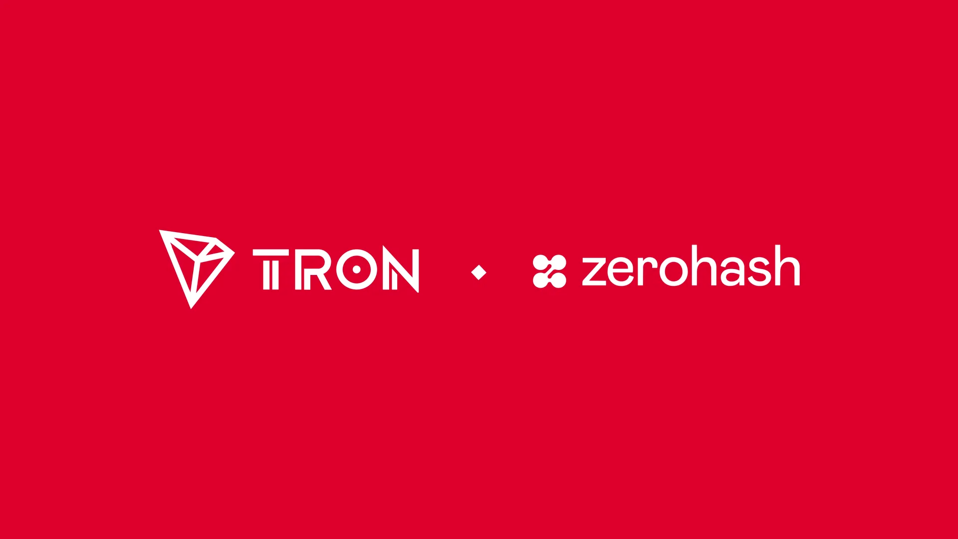
- The handshake. A flash of light streaks back to TRON red, a bracketed line says what's live, and the two logos lock up side by side.
The structure is the system. A new partner only needs a new middle beat, and the rest of the ad already knows how to behave.
Details that carry the brand
- Pacing for the feed. Each beat is short enough that someone scrolling still sees the logo lockup.
- Lighting as the bridge. Red light belongs to TRON and the partner's color takes over in the middle, so the shift in color tells the story without words.
- Logo reveals. Each partner mark gets its own moment before the lockup. In the zerohash ad, it arrives on a tile inside TRON's world first.
- One end card. TRON red, a bracketed line and the lockup, the same every time, so the series is recognizable at a glance.
I checked every cut against the TRON guidelines through the final handoff, so the ads look like they came from the same brand as everything else.